
Ready to Boost Your Productivity?
Save time and money while boosting your productivity with Zight — free tools for screen recording, screenshots, GIFs, and webcam capture.
Try Zight for FreeHow to Convert CSS Units
Follow these simple steps to get started.
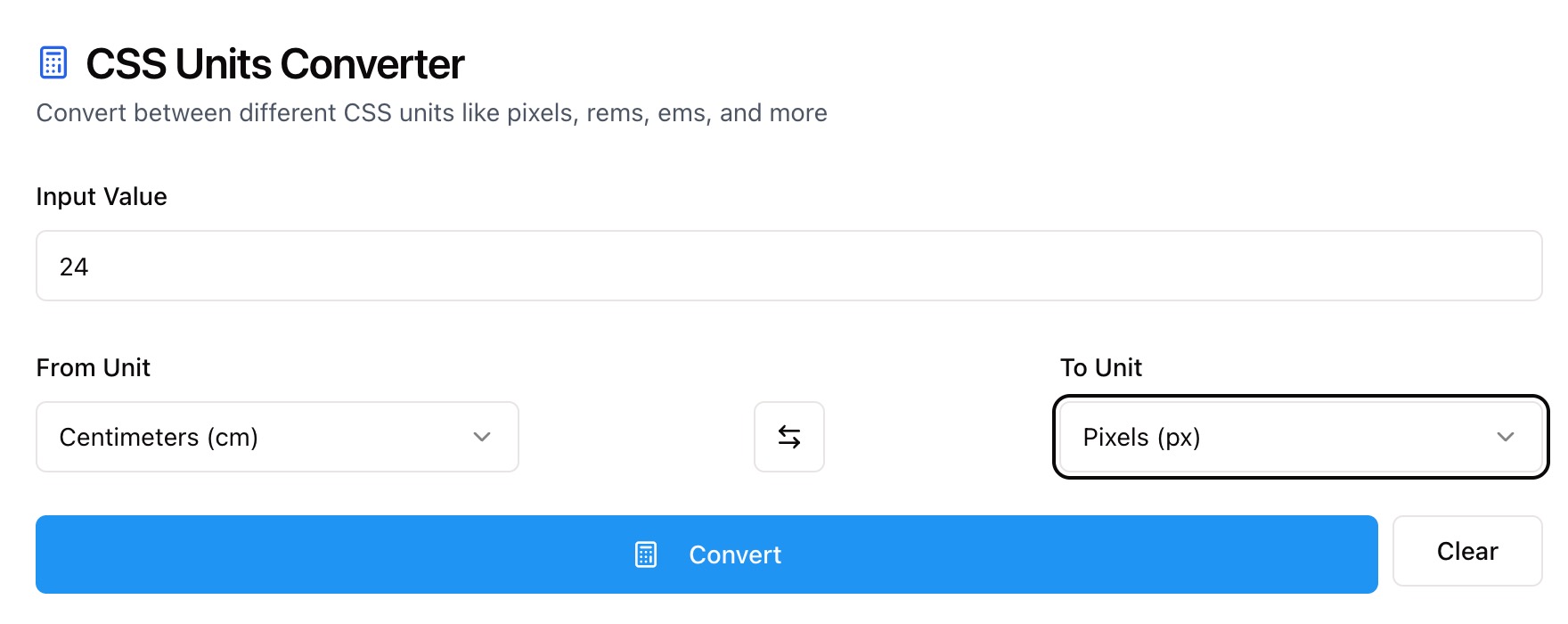
Enter Your Value
Type a number such as 24. Use decimals if needed.
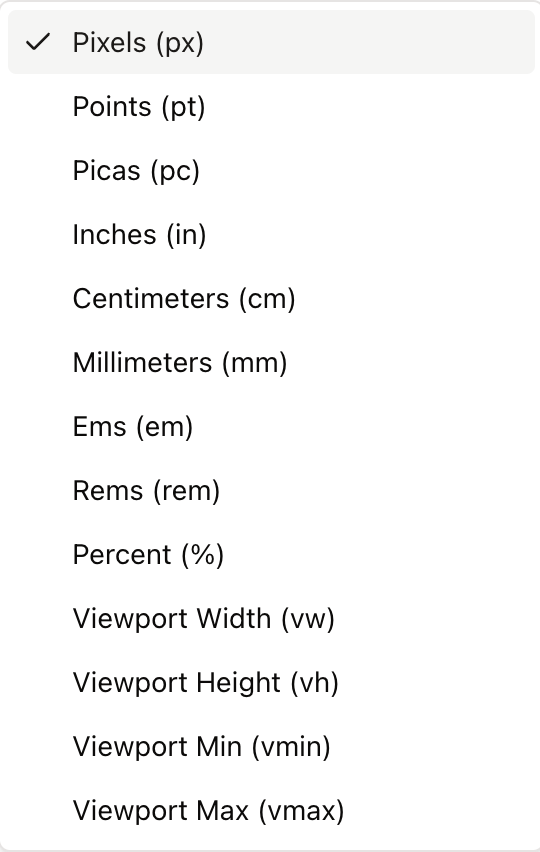
Choose Units
Zight automatically converts your JSON into clean, structured YAML. The tool preserves hierarchy, indentation, and relationships between objects and arrays, ensuring the output is accurate and ready to use.
Download or Copy YAML Output
Once the conversion is complete, you can copy the YAML result or download it as a file. The output is fully formatted and compatible with configuration tools, scripts, and documentation.
Choosing Between CSS Units
Pixels (px)
Fixed, device independent CSS pixels. Great for precise UI elements and borders.
Rems and Ems (rem, em)
Relative to font size. rem uses the root font size, em uses the element’s computed font size. Ideal for scalable typography and spacing.
Viewport Units (vw, vh, vmin, vmax)
Relative to the viewport. 1vw is 1 percent of the viewport width, 1vh is 1 percent of the viewport height. vmin and vmax use the smaller or larger dimension. Useful for fluid layouts and hero sections.
Physical Units (cm, mm, in, pt, pc)
Mapped by CSS to a reference pixel ratio. Helpful for print styles but less predictable on screens.
Conversion Notes and Accuracy
Zight converts using standard CSS assumptions:
-
1rem equals the Base Font Size you set. Default is 16px.
-
1em equals the element font size. With this tool, it uses the same base value for clarity.
-
Viewport units assume the current viewport size for percentage math.
-
Physical units follow CSS absolute unit ratios: 1in = 96px, 1pt = 1/72in, 1cm = 96px / 2.54.

Supported Use Cases
For Designers
Translate type scales and spacing between px, rem, and em. Plan fluid sections with vw and vh.
For Developers
Refactor hard coded pixels to scalable units. Align component tokens across frameworks.
For Product Teams
Standardize sizing across design files, codebases, and documentation.
For Print and Docs
Convert between screen units and points or inches for export and print styles.
Unlock More Tools
Expand your toolkit with these additional free tools
Ultimate Guide: How to Convert CSS Units
Learn how to translate measurements across CSS units with Zight’s free converter. Whether you are tuning a type ramp or building a fluid hero, this guide explains how to set context and choose the right unit.
Enter Your Value
Start with a value such as 24. You can use decimals for precise results like 14.5.
Pick the Source and Target Units
Choose From Unit and To Unit. Switch directions with the swap control to compare both ways, such as px to rem and rem back to px.
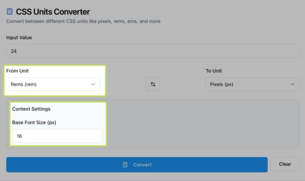
Set the Base Font Size
For rem and em, set a base font size in pixels. Most projects use 16, but design systems may use 14, 15, or 18. The converter uses this number to compute accurate relative values.
Understand Viewport Units
Viewport units scale with the browser window. 24px might equal 1.5rem, but it could also equal 1.8vw depending on viewport width. Use viewport units for sections that should grow or shrink with the screen.
Compare and Apply
After conversion, copy the result and apply it to your CSS variables, utility classes, or design tokens. Converting consistently keeps spacing, typography, and components in sync across the product.
Conclusion
Zight’s CSS Units Converter makes it easy to translate between px, rem, em, vw, vh, vmin, vmax, and print units like pt and cm. Set your base font size, convert with one click, and apply consistent values across your design system and code.
Try Zight’s CSS Units Converter today and keep every layout precise and scalable.
Frequently Asked Questions
The default is 16px. You can change it in the Base Font Size field for rem and em conversions.
rem is relative to the root font size. em is relative to the element’s current font size, so it compounds inside nested elements.
CSS defines 1in = 96px, 1pt = 1/72in, and 1cm = 96/2.54px. These ratios are consistent across browsers but may not map to true physical size on all screens.
Use vw, vh, vmin, and vmax for fluid typography, full screen sections, and responsive spacing that adapts to the browser window.
em depends on the element’s computed font size. In the tool, both use the base value you set to keep results predictable.
Percentages depend on context in CSS, so this tool focuses on unit to unit conversions. Use viewport units or rem for scalable alternatives.
Results keep useful precision. You can round to your preferred number of decimals when you copy the value.
No. All conversions occur in your browser for privacy.

