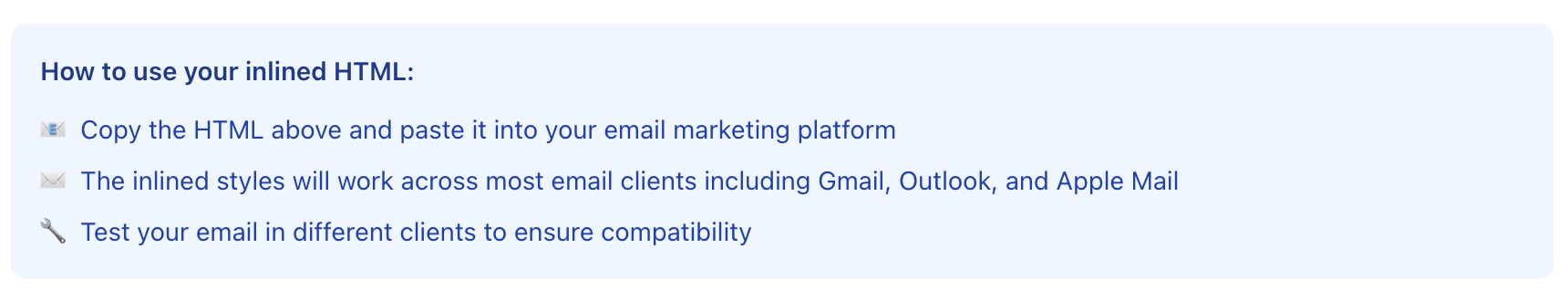
Ready to Boost Your Productivity?
Save time and money while boosting your productivity with Zight — free tools for screen recording, screenshots, GIFs, and webcam capture.
Try Zight for FreeHow to Inline CSS for Email
Follow these simple steps to get started.
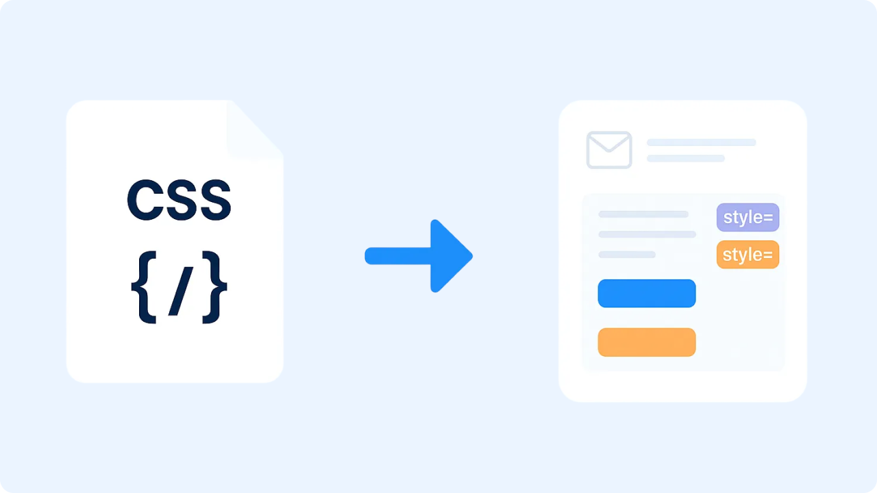
Paste Your HTML
Paste your email’s HTML content into the left box. Include all the text, images, and structure you want to style.
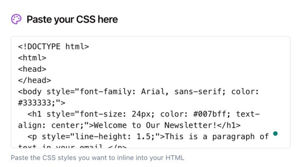
Paste Your CSS
Paste your external or template CSS into the right box. Zight will automatically map your selectors to the corresponding elements in your HTML.
Convert to Inline
Click Convert to inline and Zight instantly merges your CSS into the HTML. Copy the inlined output and paste it into your ESP or testing tool.
Choosing Between Linked CSS and Inline CSS
Linked or External CSS
Linked CSS works well in browsers but is often stripped or ignored by major email clients like Gmail and Outlook. It’s not a reliable method for email rendering.
Inline CSS
Inline CSS is embedded directly on each element, ensuring styles display consistently across all clients. It’s the safest, most widely supported approach for email HTML.
When to Use Each
Use linked CSS for web pages and templates under development. Use inline CSS for any HTML email or campaign you plan to send to real inboxes.
Why Inline CSS for Email Matters
Email clients handle CSS differently than web browsers. While browsers read and apply styles from the <head>, many inboxes strip or ignore them. Inlining ensures your text, buttons, and layouts render correctly across clients — from Gmail and Yahoo to Outlook and Apple Mail.
Zight’s inliner automatically applies your CSS rules directly to the HTML tags where they belong, saving you time and preventing display inconsistencies.

Supported Use Cases
For Marketers
Prepare campaign emails that render perfectly across all major inboxes — no broken layouts, missing fonts, or stripped styles.
For Designers
Turn HTML templates into visually consistent emails without writing extra inline code. Focus on creative design, not compatibility.
For Developers
Automate the last step of your email workflow. Combine external CSS and HTML to generate fully inlined, production-ready templates.
For Agencies and Teams
Streamline email production for multiple clients by ensuring every send meets rendering standards for Gmail, Outlook, Apple Mail, and more.
Unlock More Tools
Expand your toolkit with these additional free tools
Ultimate Guide: How to Inline CSS for Email
Learn how to turn your email HTML and CSS into fully inlined, email-safe code using Zight’s free CSS Inliner. This guide explains how to combine your content and styles so your emails look perfect everywhere.
Paste Your HTML
Start by pasting your HTML markup into Zight’s HTML input box. This should include all your content, such as text blocks, images, and buttons.

Add Your CSS
Next, paste your CSS rules into the CSS input box. Zight matches your selectors with the elements in your HTML to prepare them for inlining.
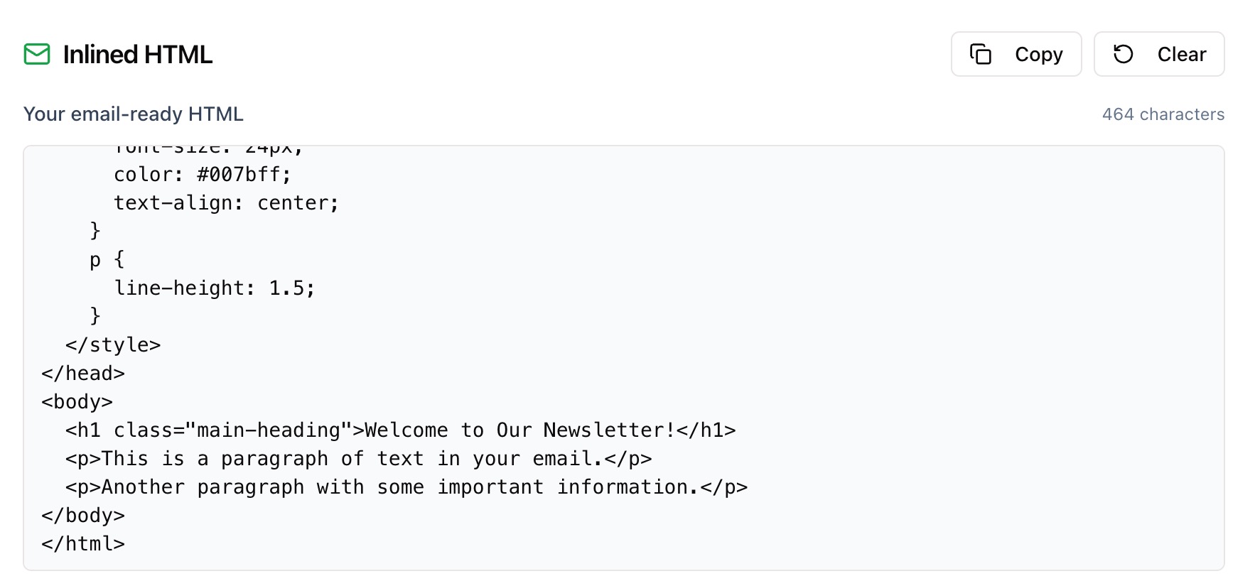
Convert and Review
Click Convert to inline. Your CSS will be merged directly into your HTML, applying inline styles to each element. Review the output, then copy it to your clipboard.

Use in Your Email Platform
Paste your new inlined HTML into your email marketing platform or ESP. The result will display consistently across email clients without relying on linked or embedded styles.
Why CSS Inlining Is Essential
Email rendering engines are unpredictable — especially in Outlook and Gmail. Inlining CSS ensures your emails maintain font, color, padding, and layout integrity, no matter where they’re opened.
Conclusion
Zight’s CSS Inliner for Email turns your HTML and CSS into fully inlined, email-safe code that works across clients. Paste your HTML, add your CSS, and convert with one click.
With Zight, creating reliable, beautiful emails is simple, fast, and secure — no manual editing required.
Try Zight’s CSS Inliner for Email today and make your next send seamless.
Frequently Asked Questions
It takes your external CSS and applies it directly to elements in your HTML so styles appear consistently across email clients.
Most email clients remove or ignore <style> blocks, making inline CSS the most reliable way to maintain design consistency.
Yes. Zight preserves supported media queries in the head so responsive emails still adapt to mobile screens.
You can paste them separately into their respective boxes — Zight combines them automatically during conversion.
No. Your markup stays intact, so you can still reference classes or IDs for testing or conditional rules.
Yes. Zight handles nested tables, inline images, and button elements correctly.
This version focuses on pasting content, but you can copy and paste any HTML and CSS from a file to inline it instantly.
No. Everything happens in your browser for privacy and speed.

