Every aspect of your website is designed and developed with your end user in mind, which means the last thing you want is for visitors to promptly leave because they’re frustrated with your website’s layout, navigation, functionality or a poor UX form design.
Just like your favorite site, a UX form should be easy to use, deliver the information a visitor needs, help them to make an informed decision, and provide a solution for a specific challenge or concern.
If not-so user friendly forms are resulting in high bounce rates, then it’s time to go back to the drawing board. Get the most out of your traffic and increase conversions with the following 7 UX form design best practices that will ensure your form design UX game is spot on.
The 7 best UX form Design Practices to Rule the World Wide Web.
The goal of any form design UX is to collect data from your visitors. If it isn’t appealing, no one is going to fill it out. We’ve all experienced a poorly designed UX form at some point. I’ve certainly encountered my share! Although most people aren’t going to reflect on the amazingness of a web form (except maybe a designer or website developer) most are going to remember a bad form design UX.
1. Visuals are Everything
Needless to say, if a site has a poorly designed, long, or difficult web form, visitors are less likely to complete it, let alone begin filling it out. This is undoubtedly a massive hindrance to gaining successful leads and conversions.
So how do you create a great experience for your visitors that’ll keep them coming back? Let’s start with the aesthetics. A successful UX form elevates your site from a purely informational platform to a powerful conversion tool, which means you need to direct your visitor’s attention to the form.
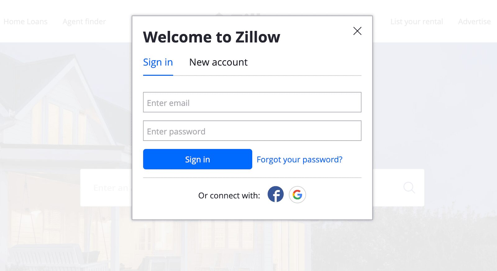
One of the best ways to do this is by minimizing the objects and text on the page. On Zillow’s site, the background fades when the popup box appears, so you can easily focus on the form.
It’s essential that you take artistic design principles, such as balance, space, and contrast, into consideration. Color, shape, size, typography, illustrations, photography, layout, and other visual elements will impact the success of your visual form design UX.
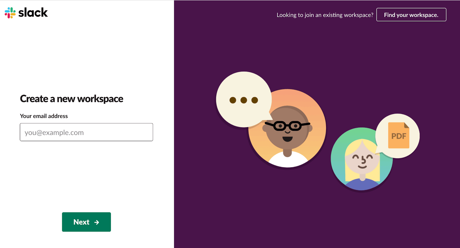
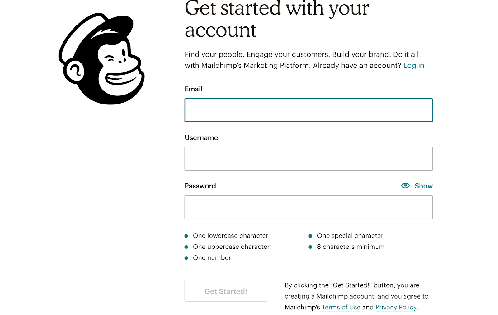
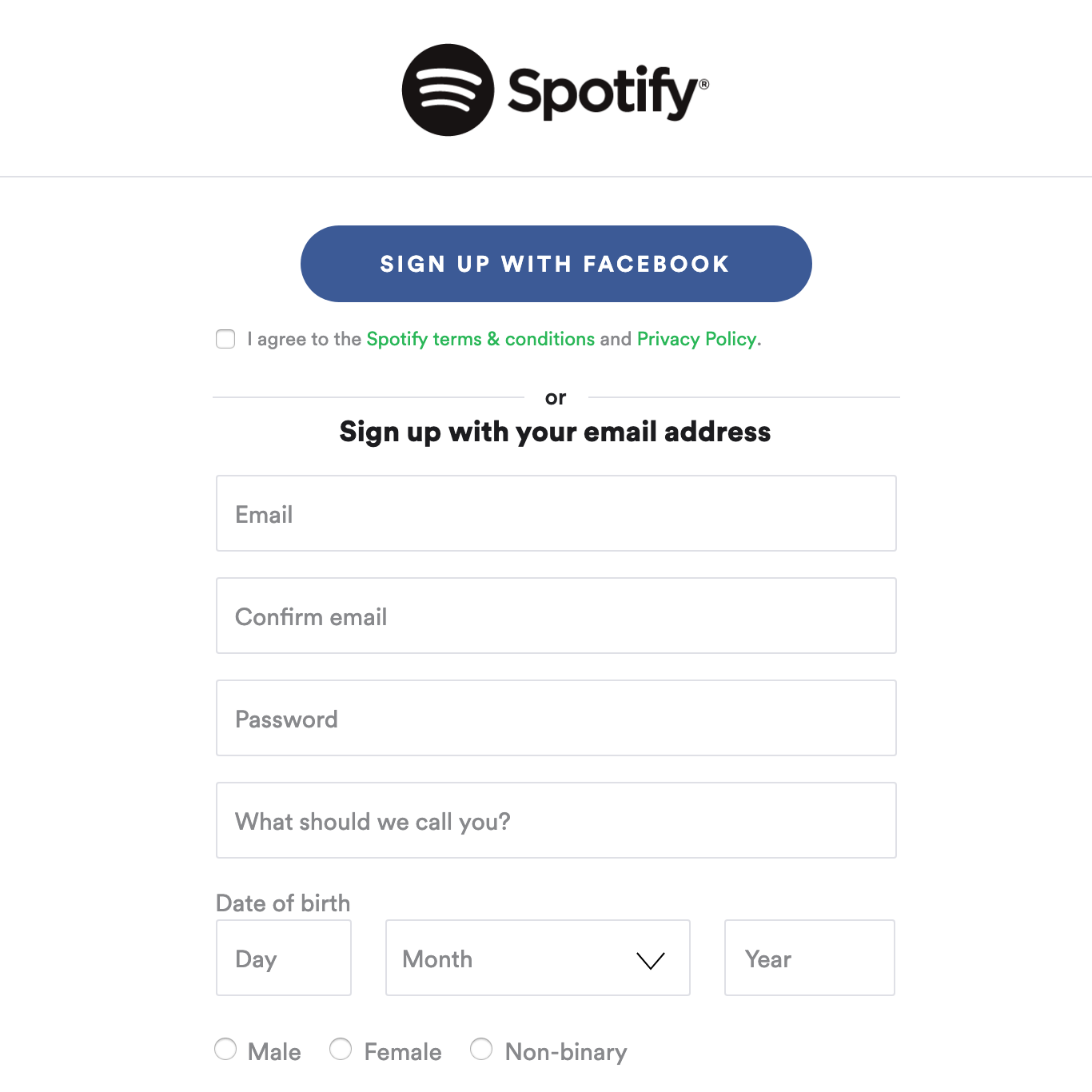
Sites, such as Slack, have a dedicated page for their form. Not only is Slack’s sign-up form super simple, but it also takes it to the next level with the contrast between bright and dark colors. As a user, this is one of the most approachable and user friendly forms out there. The visually clean design is easy to understand, draws in my focus, and encourages me to complete the form. Slack also gets bonus points for its easy integration with Zight (formerly CloudApp).
2. Show them the value and benefits
Make sure your visitors know the value they’ll gain from completing your web form. A lot of businesses depend on people successfully filling out a form, but a visitor isn’t going to convert if the form they’re being asked to fill out is unclear. I want to know what I’m filling out, and your visitor probably does too.
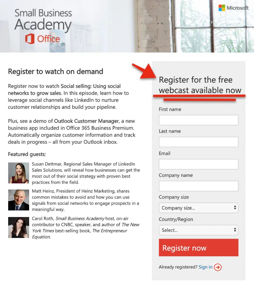
A simple, clear form title that explains what the form is for, such as Register for the free webcast available now, can make a huge impact on the success of your form.
Think of your title as an action statement, that clearly explains what the visitor will get. Carefully choose your words so they understand they’re signing up to receive a particular service.
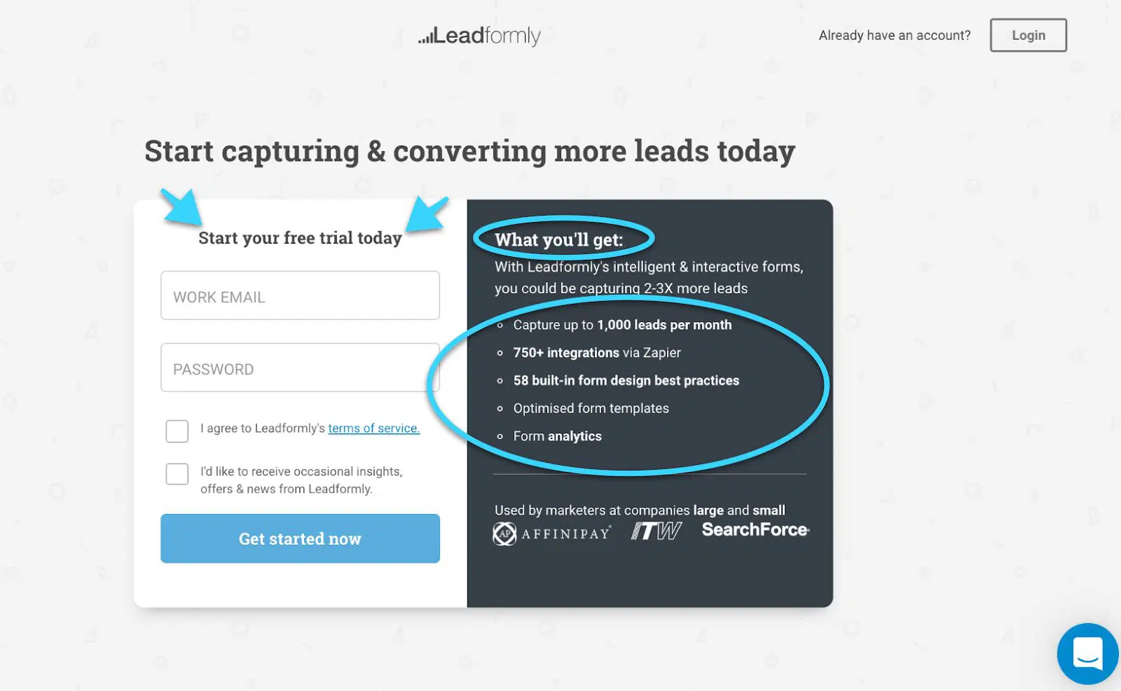
For example, offering incentives with their membership that entice them, such as exclusive deal, package or a free offer and listing the benefits below in bullet points will effectively communicate the value of completing the form.
3. Make your call to action button stand out
So now that the benefits are obvious, it’s time to make the call to action button clear. This can make or break your form design UX. This is the final action taken by your visitors before proceeding to another page. They want to know what’s going to happen when they press the button! In other words, your form is useless if they don’t know exactly what they get, or if it isn’t visible. Text and appearances are equally important here.

Tell them exactly what will happen when they click the button. Avoid “submit” and opt for more elaborate and clear calls to action, such as “I want to subscribe to your newsletter” or “start my free trial today.”
4. Straightforward and simple forms
Let’s get down to the nitty-gritty. Is your form UX design straightforward and simple to use?
A simple, straightforward and short form with a clean layout and clearly defined text fields will increase conversions and reduce the amount of time it takes to fill it out.
Here are the basics:
- Make field labels clear
- Sort dropdown lists alphabetically, with suggested answers on top.
- Suggest answers
- Enable autofill and autocorrect so information can be automatically filled in when possible
- Allow users to select an option rather than type when applicable
- Clearly mark any required text fields
- Allow tabbing between text fields
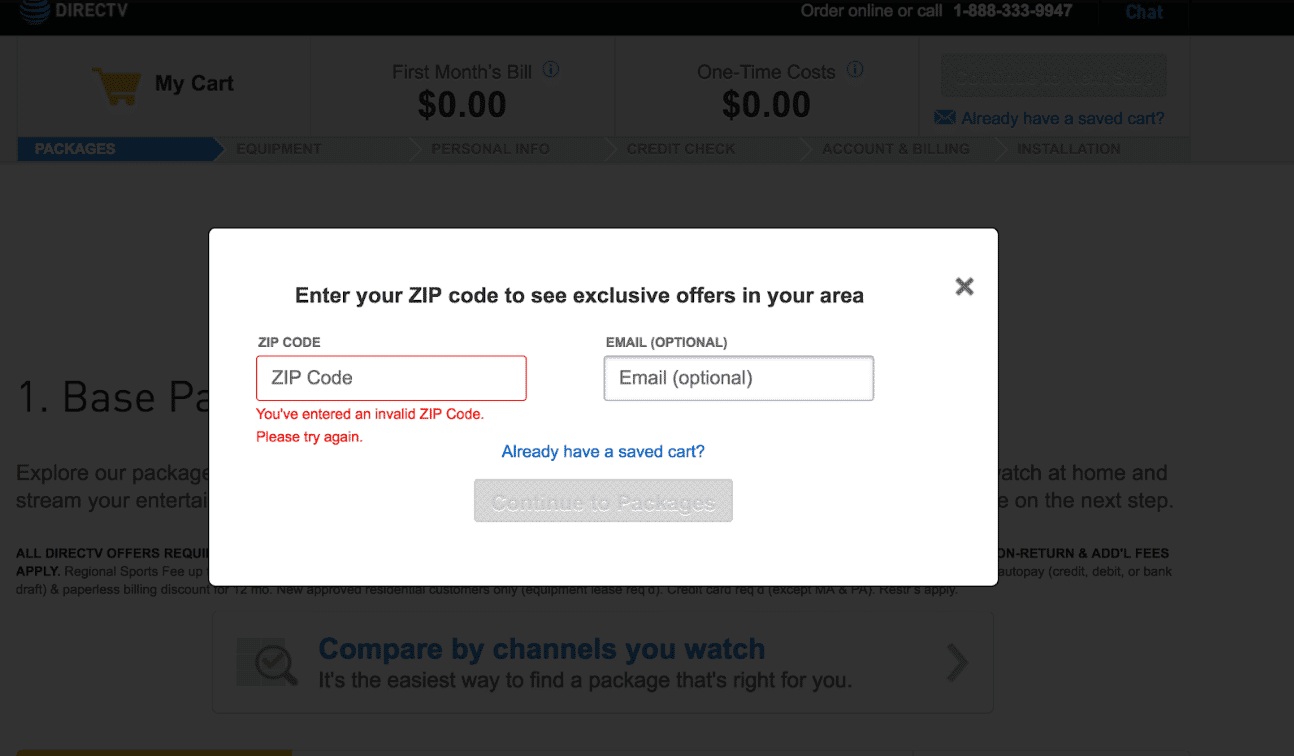
- Clearly and politely indicate errors
- Preserve data when an error is detected after they’ve submitted
- Provide progress indicators
- Provide submitted information for final review and verification
- End with a confirmation page
There’s no need to reinvent the wheel. Using familiar labels and layouts will save you and your visitors time.
There are a lot of little things that can make the process that much easier, such as clear labels, alphabetical drop-downs, suggest answers, autofill, preserving data so they don’t need to enter it again if there’s an error.
UX focuses on the end user’s overall experience. This includes their perceptions, emotions, and responses to a company’s product, system, or service. If the information you’re asking for is confusing to your visitor and they don’t complete the form, then it’s safe to say your form design UX could use some tweaking. Sometimes you might require more obscure data. Provide specific labels or give examples if it the information required could potentially be confusing or unclear. Icons or images are always exceptional alternatives to text.
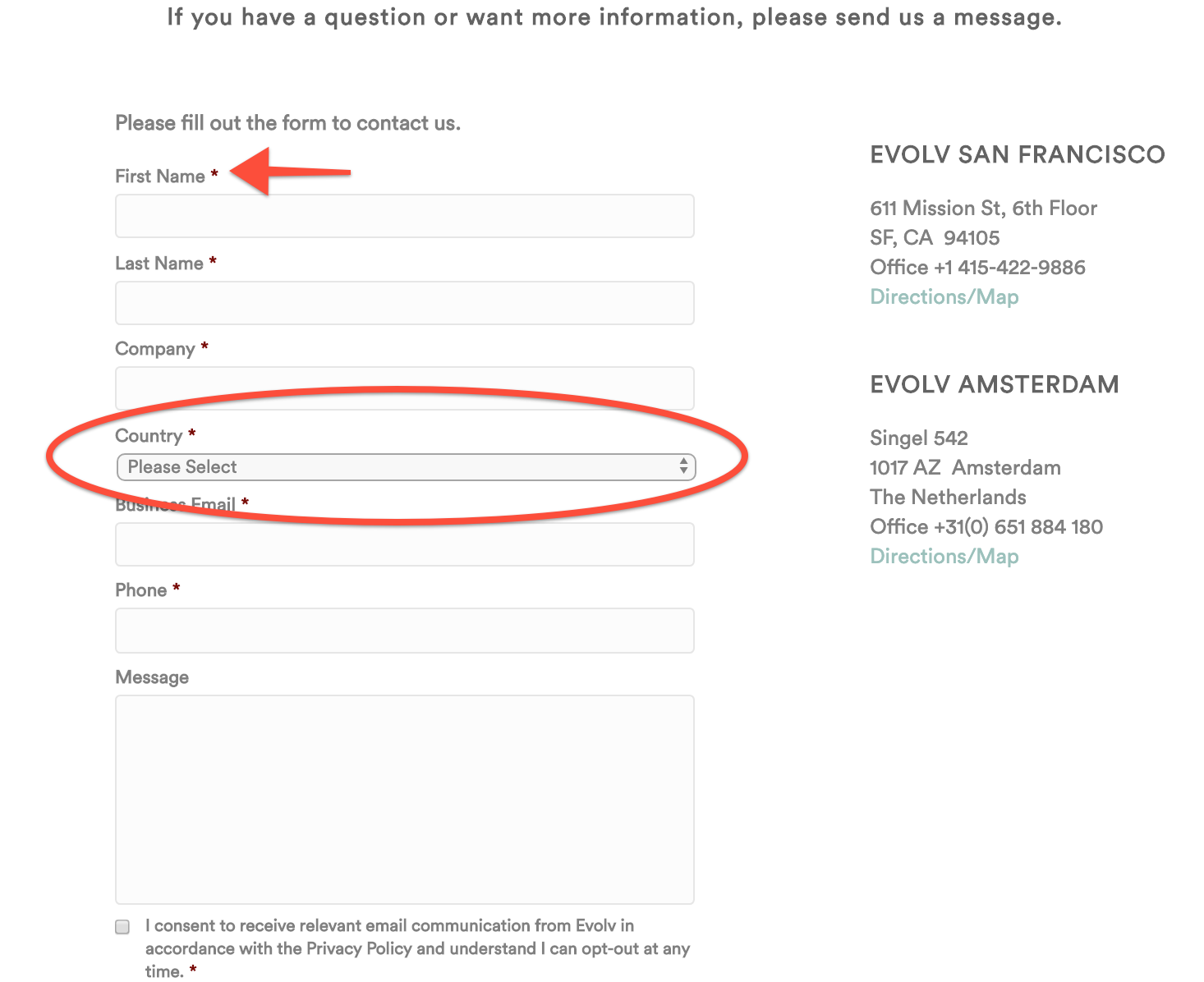
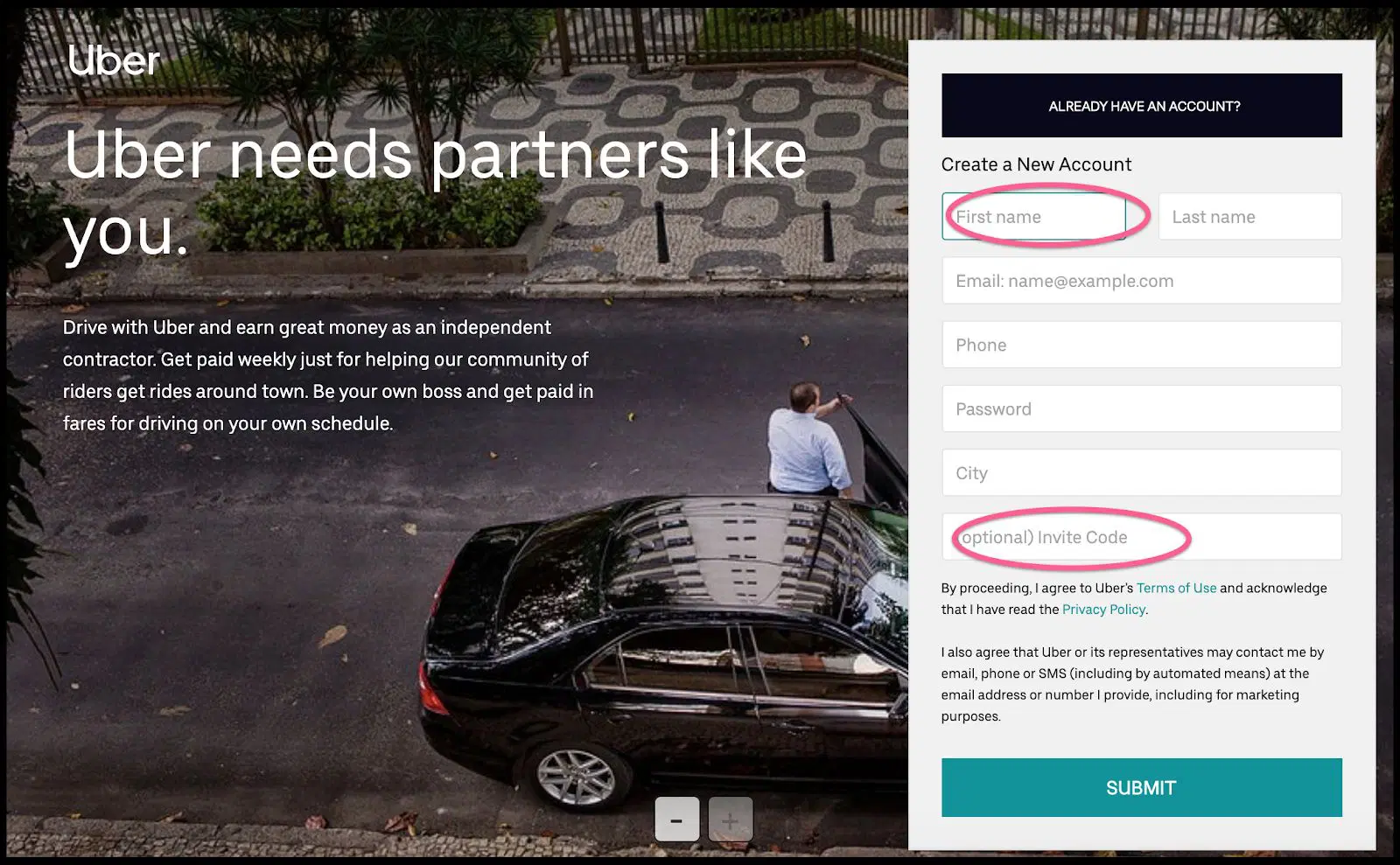
If some of the information is optional, ensure that mandatory text fields are clearly indicated with an asterisk sign. We also recommend including a shortcut to sign up with a social media or Google account.
5. Keep it short
People are busy. The quicker the better. Keep text fields to a minimum and remember less is more. The shorter your form is, and fewer the text fields they need to fill in, the less time it’ll take and the higher your participation and conversion rate will be. You always have the option of gathering further information later with the contact information they’ve provided.
Multi-step forms are common for check-out processes on e-commerce platforms. If your form needs to be a bit longer, provide a progress indicator on forms with multiple pages so visitors have a visual for how long the form will take, or how many steps they have left.
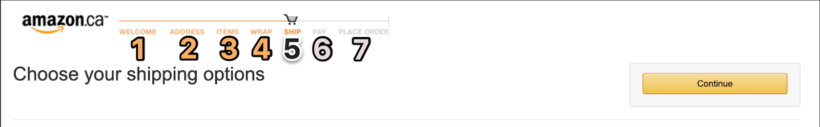
This can be done in a few ways. Provide a simple progress bar with icons or a slider, or divide your form into shorter steps, such as Amazon’s checkout process.
People are familiar with completing tasks step-by-step, so this is often recommended and preferred. Keep grouping components well in mind during the UX form design process, and make sure each completed step is clearly indicated.
Removing site navigation will also increase the chances of your visitor staying on task. Think of it as showing them the light at the end of the tunnel and eliminating distractions along the way.
6. Form Design UX #1 rule: but does it work?
One of the last, but arguably one of the most important on our list of the best UX form design practices is testing whether your form works well or not.
An effective UX form design is the key to transforming your website from a purely informational platform, to a lead generation tool that can maximize your conversion success-rate. How do you know it’s effective? You thoroughly test it yourself.
Does your form work? Is it seamlessly integrated into your site? What are the hangups or confusing sections? These are exactly the places where people will drop off. When you’re asking someone for information, they will have little patience for a poor UX form design. Make sure there is nothing that will deter them!
7. Apples or oranges and A/B testing
Once you’ve nailed the best UX form design, it’s time for A/B Testing. Comparing slightly tweaked variations is one of the best ways to design the most optimal form and get concrete data on which variation attracts more customers. Simple changes, such as your CTA text, can help you analyze different results and optimize accordingly.
Forms are crucial to your business, as they’re the tool that turns website visitors into leads. You can’t afford to have a form design UX on your website that doesn’t create a positive, painless experience.
Tailor your form to create a great experience that encourages them to keep coming back, fits your brand, fulfills your business needs, boosts conversions, and makes a lasting impression on your visitors. Get clear on who your target audience is so you can speak directly to them. We also recommend always staying open to feedback, testing your regularly, and revising it to ensure you continue to meet your goals.
We get it, designing a user friendly form that creates a positive user experience is easier said than done! Don’t underestimate the power of approachable, seamless and attractive forms that clearly indicate the value of they’ll gain from completing your form. With careful attention to the best UX form design practices, you will have the key to boosting your conversion.
At Zight (formerly CloudApp), we offer our basic features like screenshots and screen recorder for free. This allows customers to experience our value before upgrading their plan when they want access to our extra features.
Zight (formerly CloudApp) is compatible with Macs and PC. Install the Cloudapp Mac App, Windows App, iOS app, or our Chrome Plugin.
Start making annotations, and screenshots like the ones in this article with Zight (formerly CloudApp) – It’s FREE.