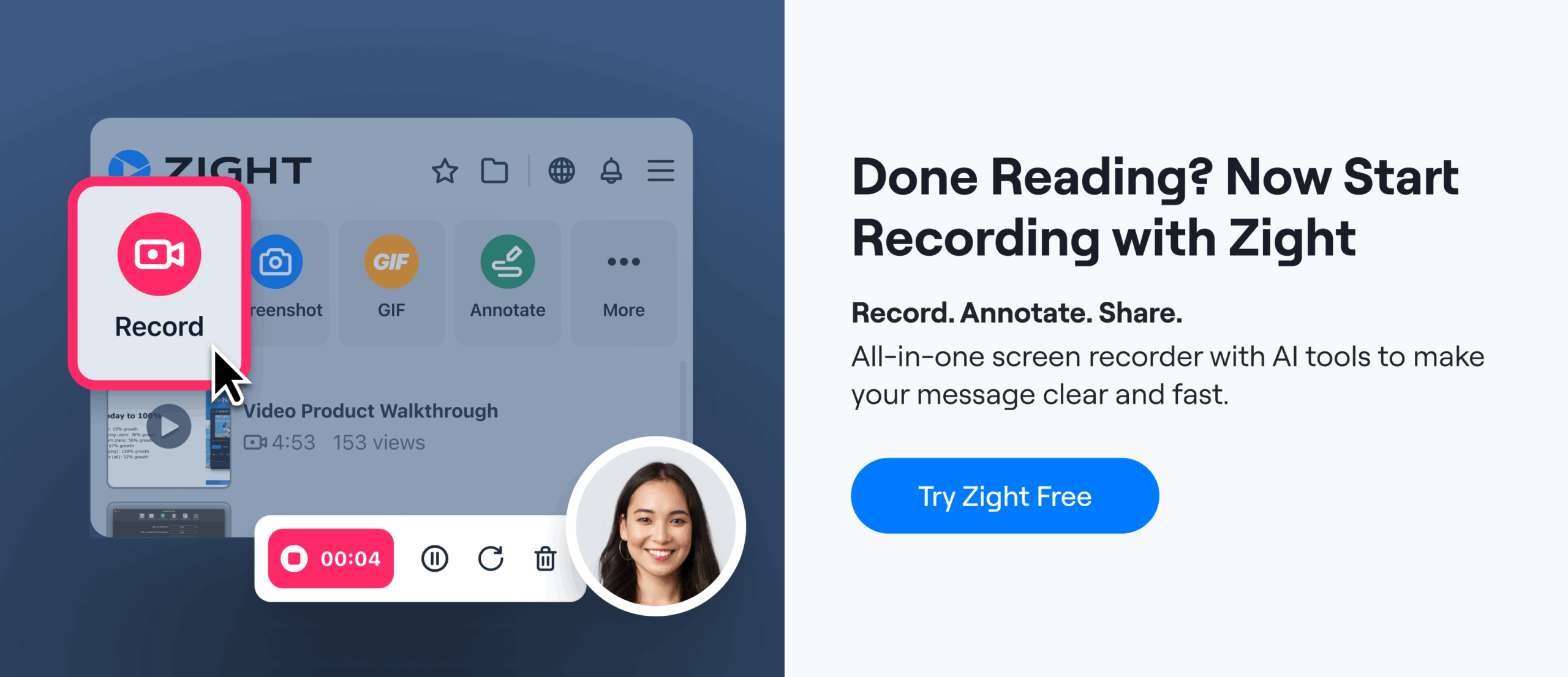
Key Takeaways:
- Why Use Them? They simplify communication by showing instead of telling, reducing the need for long explanations.
- How to Use Them? Capture only the relevant part of your screen, annotate with arrows, text, or highlights, and share via tools like Slack or cloud links.
- Best Practices: Keep annotations consistent, use clear colors and symbols, and organize screenshots for easy future reference.
Step 1: Prepare to Capture Your Screenshot
A good screenshot starts with careful preparation. When done right, it needs little annotation and gets your message across quickly. Jumping into a capture without planning can lead to cluttered, confusing images that miss the mark.Identify the Key Information to Share
Before you take a screenshot, think about what your team actually needs to see. Are you reporting a bug, explaining a process, or asking for feedback on a design? Each purpose calls for a different focus. For example, bug reports should include the error message, the state of the user interface, and any visible problems. Design feedback? Focus on the specific component you’re discussing, leaving out unnecessary background. If it’s a status update, highlight progress indicators, completed tasks, or relevant metrics. Keep it focused and actionable. A screenshot of your entire dashboard, packed with elements, forces others to sift through clutter. Instead, zoom in on the section that matters. For instance, if you’re explaining how to change a setting, capture just the settings panel, not your entire desktop with unrelated tabs and windows. Tailor the level of detail to your audience. A technical team might prefer a tightly cropped view of an issue, while others may benefit from a bit more context. If you’re dealing with multiple issues, capture them separately. This keeps each image clear and makes it easier for your team to reference later. Plus, it helps organize your visual documentation, each screenshot serves a single purpose instead of trying to cover everything at once. Timing matters, too. Avoid capturing during animations or loading screens. These fleeting moments can confuse your team and don’t provide a clear view of what they need to see. By following these steps, your screenshots will deliver the right insights without unnecessary distractions.
 Optimize the Layout for Clarity
Once you know what you’re capturing, take a moment to set up your screen for a clean and clear presentation. This small step can make a big difference in how professional and effective your screenshot looks. Start by closing any unnecessary windows, tabs, or applications. Extra elements add visual clutter and distract from your main point. If you’re capturing a web interface, shut down unrelated tabs. If it’s a desktop app, minimize or hide other windows. Adjust your zoom level to ensure everything is easy to read while still providing enough context. Many desktop apps allow you to tweak zoom or scaling settings, use these to make your screenshot legible without requiring others to zoom in themselves. Stick to the native resolution of your screen. This keeps text sharp and interface elements crisp, so your screenshot looks good even on devices with different screen sizes. Make sure the key content is centered and framed properly. The most important details should be in the center or upper part of the image, where viewers naturally look first. Avoid cutting off critical elements at the edges. For instance, if you’re pointing out a button, show the button in its full context, along with enough surrounding interface to clarify its location. Be mindful of sensitive information. Before capturing, remove or blur anything confidential like passwords, API keys, customer data, or financial details. You can either crop the screenshot to exclude sensitive areas, blur them during annotation, or create a sanitized version using dummy data. Skipping this step can lead to accidental sharing of private or proprietary information. If your team often checks updates on mobile devices, make sure your screenshot is mobile-friendly. Place important details in the center and ensure text is large enough to read on smaller screens. Avoid wide screenshots that force horizontal scrolling on phones. Finally, if you’re documenting a process with multiple steps, break it into several screenshots. Showing steps one, two, and three in separate images is far clearer than cramming everything into one complicated capture. With your capture area prepared, you’re ready to move on to annotating your screenshot. A well-prepared image sets the foundation for effective communication, ensuring your team gets the message without confusion or wasted effort.Step 2: Annotate Your Screenshot
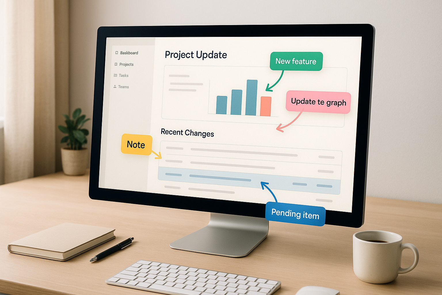
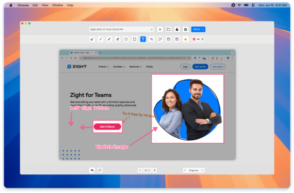
Once you’ve captured a solid screenshot, the next step is to make it crystal clear with annotations. These annotations help focus your team’s attention exactly where it’s needed. Without them, important details might slip through the cracks, leaving your team unsure of what to address or prioritize. The idea here is simple: use annotations to make your point quickly and effectively. A single screenshot with well-placed arrows and notes can often communicate more than a lengthy explanation ever could. This step ensures your screenshot becomes a bridge between capturing an issue and providing clear, actionable insights.Choose the Right Annotation Tools
Different tools let you emphasize specific details in your screenshot. Here’s how to use them effectively:- Arrows: These guide attention to key UI elements or areas that need action. They’re perfect for highlighting workflow steps or pinpointing the exact location of a problem.
- Text boxes: Sometimes an image isn’t enough. Use text boxes to add context or explanations, but keep them short, a few words are far more effective than a paragraph.
- Highlights and colors: Use these to draw attention to critical areas. For example, red can signal urgency, while yellow might mark sections that need review.
- Shapes (circles, rectangles, boxes): These help organize related content visually. For instance, circle an interface issue and pair it with an arrow pointing to the correct element.
“It’s so easy to edit the picture, and add arrows and squares to really make your point stand. A huge plus I haven’t found in other apps is that you can ‘pixel’ all the sensitive information perhaps you don’t want to share.” – Luisa Zapata García, Strategic Customer Success Manager, Globalization PartnersAs always, protect sensitive data when annotating. Use tools like pixelation or redaction to hide passwords, API keys, customer information, or financial details. Platforms like Zight make this process seamless by combining screen capture and annotation in one place. As Massimo Rigoni Savioli, CEO of SOSidee, explains, “It also includes built-in editing tools that make it simple to annotate, highlight, or add details in just a few clicks.” In fast-paced situations, stick to minimal annotations, maybe a single arrow and a brief text label. For training materials or documents that will be referenced later, go for more detailed annotations to ensure clarity over time.
Maintain Consistency in Annotations
Once you’ve chosen your tools, it’s important to use them consistently. This creates a visual language that your team can quickly understand.- Establish a color system: Use bold, contrasting colors for critical information (like red for urgent issues) and neutral tones for less important details. This ensures the most important elements grab attention first.
- Limit your color palette: Stick to three or four colors to avoid confusion. For example, you might use one color for questions, another for action items, and a third for completed tasks.
- Consider accessibility: Avoid problematic color combinations like red and green, which can be hard for colorblind team members to distinguish. Add symbols or text labels for extra clarity. Make sure text annotations are easy to read by using a font size of at least 12 points and ensuring good contrast against the background.
Step 3: Share Annotated Screenshots with Your Team
After annotating your screenshot, the next step is to share it right away. Don’t let it get lost in endless email threads or chat messages. Instead, pick a sharing method that aligns seamlessly with how your team works.Choose the Right Sharing Method
Using direct cloud links is a smart move, it ensures everyone is always looking at the most up-to-date version. Cloud-based tools upload and share your annotated screenshots instantly, avoiding the chaos of multiple versions floating around. As Luisa Zapata García, Strategic Customer Success Manager at Globalization Partners, puts it:“The fact that this saves on the cloud and I can share those links directly, both internally and externally is a huge plus.”Another tip: embed screenshots directly into your team’s communication tools. Whether it’s Slack, Microsoft Teams, or Jira, integrating your annotation tool with these platforms can streamline the process. New screenshots can be automatically shared in specific channels, complete with notifications to keep everyone informed. If email is your go-to, embed the screenshot or include a link to its latest cloud version. This avoids the hassle of attachments and ensures easy access. Timing is everything. Share your screenshots as soon as possible after meetings or discussions to keep the context fresh and the momentum going.
Make Feedback a Team Effort
Once your screenshot is shared, invite the team to collaborate. Encourage them to add comments, highlight key areas, or even make their own annotations. Many modern tools allow for real-time feedback, transforming a static screenshot into a dynamic resource filled with valuable insights. When sharing, ask direct questions like, “Does this layout work for mobile?” or “Are there any issues with this workflow?” This approach encourages focused and actionable feedback. Collaborative editing or commenting ensures that all input stays in one place, making it easy to reference later. For larger teams, setting up dedicated channels or threads for visual feedback can be a game-changer. These organized spaces make it easier for everyone to contribute and keep discussions on track. Over time, these annotated screenshots can become a rich knowledge base. Timeliness is crucial when it comes to feedback. Aim for responses within 24 to 48 hours for non-urgent items to maintain momentum and ensure discussions stay relevant. This collaborative process helps your team stay aligned and ensures that visual updates are actionable and effective.Step 4: Document Annotated Screenshots for Future Use
Once you’ve shared your annotated screenshots, the next step is to document them for long-term reference. This practice helps your team keep track of key decisions and workflows, ensuring everyone stays aligned over time. Proper documentation also strengthens communication, especially in asynchronous environments. Think of these screenshots as a permanent resource for onboarding, training, and maintaining process consistency. Each captured image serves as a future reference point, answering questions and clarifying steps without the need for back-and-forth discussions. A well-maintained library of annotated screenshots can be a game-changer. It reduces the volume of support tickets and allows your team to focus on more complex tasks.Organize Screenshots Systematically
To make your screenshots truly useful, organize them in a way that’s logical and easy to navigate. Start by creating a categorization system that reflects how your team searches for information. For example, you could group screenshots by department (like Marketing, Customer Support, or Product Development), by process type (such as Onboarding or Bug Reporting), or by the software or tools they relate to. Using cloud-based storage solutions is a smart move. These platforms often support tagging and metadata, allowing a single screenshot to appear in multiple categories. For instance, a screenshot explaining how to report a bug in your project management tool could be tagged under both “Bug Reporting” and “Project Management Tool”, making it easier to find. Consistency is key when naming files. Adopt a naming convention like “YYYY-MM-DD_ProcessName_Version” to make screenshots instantly recognizable. For instance, instead of using a generic name like “Screenshot_001.png”, opt for something like “2025-11-28_SlackIntegration_v2.0.png.” This approach makes files easier to search and understand at a glance. Version control is another important aspect. When processes or tools change, create a new version of the screenshot rather than overwriting the original. This not only preserves a historical record of your workflows but also provides a fallback if you need to reference older processes. Schedule quarterly reviews of your screenshot library to ensure everything stays up to date and reflects current practices. For screenshots that include sensitive information, such as customer data or proprietary processes, implement role-based access controls. This ensures that only authorized team members can view them while keeping the documentation accessible to those who need it. Once organized, these screenshots can be compiled into visual guides that make learning and process adoption much easier.Use Screenshots in Visual Guides
While individual annotated screenshots are helpful, combining them into step-by-step visual guides takes their utility to the next level. These guides simplify complex processes, reduce the need for lengthy explanations, and minimize errors during execution. A well-designed visual guide can make onboarding faster and more effective. When creating visual guides, arrange the screenshots in the exact order someone would follow to complete the process. Include brief text descriptions between screenshots to provide context and explain the purpose of each step. This mix of visuals and text ensures the guide is accessible to people with varying learning preferences. AI-powered tools can make this process even easier. Platforms like Zight can automatically generate titles, summaries, and structured documentation from your screenshots. This turns a simple collection of images into polished step-by-step guides, Standard Operating Procedures (SOPs), or how-to documents. Store these visual guides in your team’s central knowledge base to ensure they’re easy to find. When new team members join, they can access these guides to learn processes independently, reducing the need for one-on-one training. This self-service approach not only saves time but also ensures consistent training quality. Make it a habit to update your visual guides whenever processes change. Add a date stamp to show when the documentation was last reviewed and confirmed accurate. This is especially important for customer-facing materials, where outdated information can lead to confusion and erode trust. Finally, keep track of which guides are accessed most often. This data can highlight areas where your team encounters the most questions, helping you identify which processes might need more detailed documentation. By gathering feedback and monitoring usage, you can continuously refine your guides, ensuring they remain a valuable resource for your team.
 Best Practices for Consistent Team Communication
Building on the use of annotated screenshots, having consistent team standards takes communication to the next level. Screenshots with annotations only work if everyone on the team uses the same visual language. If colors, symbols, or styles are inconsistent, it can lead to confusion and slow down decision-making. The solution? Create clear, shared guidelines that everyone can easily follow. These guidelines don’t need to be overly complex, they just need to be consistent. When your team speaks the same “visual language”, communication becomes faster, clearer, and less likely to be misunderstood.Develop Team Annotation Standards
Start with a shared annotation guide. Standardize the colors, symbols, and styles your team uses based on your specific workflow. This eliminates guesswork and ensures that everyone interprets annotations the same way. Keep things simple at first. Focus on five to seven core annotations that your team uses most often. Trying to introduce too many at once can overwhelm people and make it harder to adopt the system. As your team gets comfortable, you can gradually expand the standards. For color coding, assign clear meanings to specific colors. For example, you could use different colors for team members, departments, or priority levels. Stick to three or four colors to keep things clean and avoid visual clutter. When it comes to text annotations, keep them short and consistent. Use the same font size, placement, and limit each annotation to three to five words. The screenshot itself provides the context, so the text only needs to highlight the specific action or note. Different tasks may need different approaches. For example:- Project management updates: Use color-coded status indicators and numbered circles to show priority.
- Design feedback: Add directional arrows to highlight suggested changes.
- Technical documentation: Use frames to emphasize key code sections and numbered steps for processes.