- Purpose: Watermarks deter content misuse and promote brand recognition.
- Design: Use your brand’s colors, fonts, and a simplified logo. Keep it clean and readable.
- Consistency: Apply the same style, size, and placement across all videos.
- Technical Details: Use PNG files, design at 300 DPI, and test for clarity on different devices.
- Placement: Bottom-right is common, but adjust for content or platform needs.
- Transparency: Aim for 50–70% opacity to blend into the video without distracting viewers.

How to Create Your Own WATERMARK
Matching Watermark Design with Your Brand
Your watermark should feel like an extension of your brand. When someone sees it, they should immediately associate it with you, even before noticing any text or logos. This alignment lays the groundwork for the more detailed design tips covered later. Watermarks are more than just a mark on your videos; they’re a visual reminder of your brand’s identity. If your watermark feels disconnected from the rest of your branding, you’re missing a chance to strengthen recognition and create a seamless experience across all your content.Using Your Brand Colors, Fonts, and Logo
To give your watermark a polished and cohesive look, stick to your brand’s established visual elements. These include your colors, fonts, and logo, the key ingredients of brand recognition. Incorporating them into your watermark ensures consistency and professionalism. Color consistency is especially important. Colors evoke emotions and stick in people’s memories faster than text or shapes. Start with your primary brand colors but consider using secondary or accent colors in cases where your main color clashes with the video’s visuals. Font choice should align with your brand’s typography. If you use a specific font for headlines or logos, incorporate it into your watermark. Just make sure it’s easy to read at smaller sizes by avoiding overly ornate or decorative fonts. Logo integration needs careful thought. Full logos can sometimes be too detailed for a watermark. Instead, use a simplified version, a logomark, or a brand symbol that captures the essence of your brand without overwhelming the video.Keeping the Same Style Across All Videos
Consistency isn’t just about design; it’s about how your watermark is applied. A consistent watermark builds trust and helps your audience recognize your brand across all your videos. Set clear, documented guidelines for your watermark’s placement, size, and transparency. This ensures that whether you or someone else on your team is creating videos, the watermark always looks professional and cohesive. Consistency also means considering how your watermark adapts to various video formats and platforms. Create templates for different types of content while keeping the core elements of your watermark intact. This way, your branding stays recognizable no matter where your videos appear.File Format and Resolution Guidelines
Getting the technical details right is just as important as the design itself. The file format and resolution of your watermark directly affect how sharp and professional it looks across platforms and devices. Technical Tips:- Use PNG files with transparent backgrounds for maximum flexibility.
- Design your watermark at 300 DPI to ensure it looks crisp in any application.
- Create multiple size variations (e.g., 100×100 to 300×300 pixels) to fit different video resolutions.
- Use a clear naming system for files that specifies size, format, and intended use.
Core Elements of Good Watermark Design
A well-thought-out watermark strikes the right balance between showcasing your brand and maintaining an enjoyable viewer experience. A strong watermark not only protects your content but also subtly reinforces your brand identity without overwhelming the visuals. By focusing on the essentials, you can create a watermark that complements your videos rather than detracting from them.Keep It Simple and Subtle
Simplicity is key when designing a watermark that feels natural within your content. Overly complex designs can become unreadable when scaled down, so it’s important to focus on clarity and minimalism. Stick to one primary element. This could be your logo, brand name, or a recognizable symbol. Avoid cramming multiple elements together, as this can make the watermark look cluttered. If your logo has intricate details, consider creating a simplified version for watermarking. This might mean using just the initials of your brand, a clean icon, or a straightforward text version of your name. Bold shapes and clean lines work best. Thin lines and delicate details often blur or disappear when compressed for video, so test your watermark at its final size to ensure it remains sharp. When it comes to typography, bold and readable fonts are your safest bet. Decorative or script fonts may lose clarity at smaller sizes, so opt for sans-serif fonts that maintain their legibility. Also, make sure there’s enough contrast between your text and the background of the watermark itself to keep everything clear.Setting the Right Transparency Level
Transparency plays a huge role in how your watermark integrates with your video. The goal is to make it visible enough to serve its purpose while blending seamlessly into the content. The ideal opacity range for most watermarks is 50% to 70%. This range ensures your watermark is noticeable but not distracting. If your priority is subtlety and minimal viewer interference, lean toward the higher end of this range. On the other hand, if stronger brand visibility is more important, you might opt for lower transparency closer to 50%, even if it stands out slightly more. Transparent backgrounds are a must. Watermarks with solid backgrounds can create harsh, distracting shapes that draw unnecessary attention. A transparent background allows the watermark to overlay naturally, regardless of the scene behind it. Always test your watermark’s transparency against different backgrounds. A watermark that looks perfect over a dark background might fade into invisibility on a lighter one – and vice versa. Striking the right balance ensures consistency across all your video content.Size and Position Guidelines
The size of your watermark matters. It should be large enough to be noticeable but small enough to avoid disrupting the viewer’s experience. Aim to keep your watermark within 5–10% of the screen area. For standard HD videos (1920×1080), this typically translates to watermarks measuring 100×100 to 200×200 pixels. For 4K content, you can scale these dimensions proportionally while maintaining the same relative size within the frame. Consistent placement builds recognition. The bottom-right corner is a popular choice since it’s both unobtrusive and where viewers naturally expect branding. This position usually avoids covering key visual elements in most videos. However, the nature of your content might require adjustments. For instance, tutorial videos often need the bottom-right corner clear for interface elements, making the bottom-left or top-right better options. Similarly, product demos may require repositioning to avoid obscuring important details. To maintain consistency across different formats, create positioning templates tailored to various video layouts. A watermark that works well in a horizontal format might end up awkwardly placed in vertical content for social media. Templates help ensure your watermark looks polished across all platforms.Test on Different Devices and Platforms
Your watermark might look great on one device but fail on another. Testing across a variety of devices and platforms is critical to ensure it performs well everywhere. Start with mobile testing, as a significant portion of viewers will watch your content on smaller screens. A watermark that feels subtle and professional on a desktop monitor might be barely visible on a phone. Conversely, a watermark that’s clear on mobile might appear oversized or intrusive on a larger display. Platform compression can also impact the quality of your watermark. Upload test videos to your primary platforms and review how the watermark holds up after processing. Take into account different viewing environments as well. People watch videos in all sorts of conditions, from bright sunlight to dimly lit rooms, and everything in between. A watermark that’s clear in ideal lighting might disappear under less favorable conditions. Test visibility across varying brightness levels to ensure consistency. Finally, check for color accuracy across devices. Colors can vary significantly depending on the screen, potentially altering the look of your watermark and affecting how well it represents your brand. Ensuring your colors stay consistent helps maintain a professional appearance and reinforces brand recognition.Where and When to Place Watermarks
Placing watermarks effectively is all about striking the right balance and making sure your brand is visible without disrupting the viewer’s experience. The goal is to choose spots that enhance visibility while considering platform-specific requirements and audience expectations. Below are some practical tips for where and when to place watermarks to protect your content and maintain a professional look.Best Placement Practices
When deciding where to position your watermark, focus on screen-safe zones, areas that are visible on all devices, even when the content is cropped or resized for different screen ratios. A popular choice is the bottom-right corner, as it typically aligns with viewer expectations and avoids interfering with the main content. However, be mindful of platform-specific interface elements. For instance, YouTube’s playback controls may obscure watermarks placed at the bottom during the first few seconds of a video. Similarly, Instagram’s overlays can block portions of your watermark, so test placement carefully. If your video includes subtitles or captions, you’ll need to be even more strategic. Since captions usually appear along the bottom, placing your watermark in the top-left or top-right corner can prevent overlap and ensure both elements are visible. For added security, consider center placement. By positioning a watermark that covers about 40% of key visual areas with at least 50% transparency, you can deter unauthorized use while still keeping the video watchable. This is especially useful for preview content or sensitive materials. When creating TV commercials, placement can directly impact engagement. Research shows that placing a watermark in the top-left or bottom-right corner can boost response rates by 8.3%, making it a smart choice for maximizing viewer recall and interaction.Timing Options for Watermarks
Watermarks don’t always need to be static. Choosing the right timing can enhance both the viewing experience and your branding efforts.- Static watermarks: These remain visible throughout the entire video, ensuring consistent branding. They’re ideal for tutorials, educational content, and branded presentations where continuous identification is key.
- Dynamic watermarks: These appear only during specific moments or fade in and out during transitions. This approach reduces viewer fatigue while keeping your brand visible during key scenes or critical moments.
Adjusting for Different Platforms and Content
Your watermark strategy should adapt to the unique demands of desktops, mobile devices, and social media platforms.- Desktop viewers: With larger screens, you can use more detailed watermarks, including intricate logos or additional text elements, without sacrificing readability.
- Mobile devices: Smaller screens call for simpler designs. Stick to your most recognizable branding element, like a logo or initials, and avoid clutter.
- Social media platforms: Each platform has its quirks. For example, Instagram Stories and TikTok videos use vertical formats, so you may need to reposition watermarks to avoid being covered by interface elements. On Facebook, where many users watch videos without sound, clear and prominent visual branding ensures your message lands.
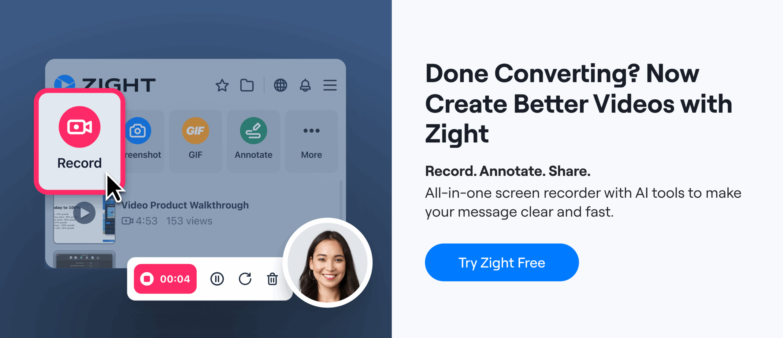
Managing Watermarks with Zight
Zight takes the hassle out of watermark management by integrating custom branding directly into your content creation process. With Zight, you can handle watermarking for recordings, screenshots, and GIFs all in one place – no need for additional software. This not only saves time but also ensures your branding stays consistent across all your visual materials.Creating Custom Watermarks with Zight
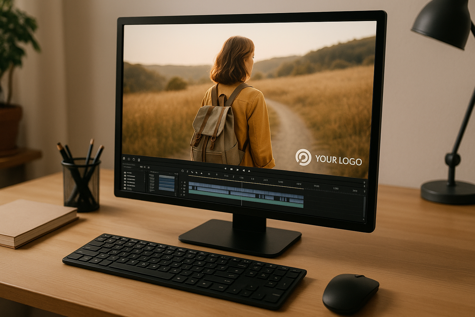
Zight makes it easy to create and apply custom watermarks. You can upload your logo in various formats, adjust its transparency to align with your brand guidelines, and set a default position for it to appear. Whether you’re snapping a screenshot or recording a lengthy tutorial, your watermark will show up with the perfect opacity and placement every time. For teams, the Team plan ($9 per user/month) allows you to standardize watermark settings across all members. This means everyone uses the same placement, size, and transparency settings, ensuring a unified brand presence. Zight also provides flexibility in customizing watermark placement for different types of content, so your branding remains consistent across formats.Multi-Platform Support and Integrations
Zight ensures your watermarked content looks consistent across devices, from Mac and Windows to Chrome and iOS. Plus, its integrations with tools like Slack, Microsoft Teams, and Jira make it easy to incorporate watermarked visuals into your existing workflows. For example, if your team uses Microsoft Teams, Zight lets you record meetings with your watermark automatically applied. You can then share these recordings directly within Teams channels, perfect for training sessions or client presentations where consistent branding is essential. The Chrome extension is another handy tool, letting you capture and watermark website screenshots, record browser-based tutorials, or create GIFs of web applications. Your custom branding is applied instantly, keeping your workflow seamless.
 Using Analytics and AI to Improve Watermarks
Zight takes things further with analytics and AI-powered tools, available in the Team and Enterprise plans. These features help you evaluate how your watermarked content performs. By tracking metrics like views and engagement, you can determine whether your watermark placement and design are working effectively.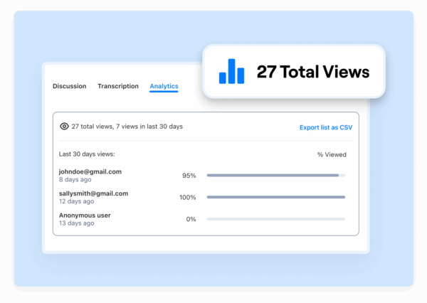 Zight’s AI tools also enhance your branded content. For instance, when the platform generates transcriptions of your videos, the result is a polished presentation that reflects your brand identity through both visuals and text. Enterprise users gain access to even more advanced analytics, offering insights like viewing patterns and engagement trends to refine watermark strategies further. Additionally, Zight’s AI translation features ensure your watermark settings stay consistent across different language versions of your content. These tools are especially helpful when creating content at scale, as they provide actionable data to guide future design improvements and maximize audience engagement.
 Conclusion
Crafting effective video watermarks is all about striking the right balance between showcasing your brand and maintaining a positive viewer experience. A well-designed watermark not only protects your content but also reinforces your brand identity without being intrusive. By sticking to the principles outlined here, keeping designs clean and subtle, adjusting transparency thoughtfully, and placing watermarks strategically, you can ensure your content looks polished and professional. Consistency is key. Using the same watermark design, placement, and timing across all your videos, screenshots, and GIFs reinforces brand recognition. This means sticking to your brand’s colors, fonts, and overall style across platforms and content types to create a unified look. Both the technical and creative sides matter. Testing your watermarks on different devices and platforms ensures they remain clear and correctly positioned, whether your audience views your content on a desktop, tablet, or smartphone. For seamless watermark management, tools like Zight simplify the process. Zight’s platform integrates watermarking directly into your workflow, automatically applying your custom branding to videos, screenshots, and GIFs. Their Team plan, priced at $9 per user per month, ensures everyone on your team uses the same settings, keeping your branding consistent across all content. With support for multiple platforms and integrations with tools like Slack, Microsoft Teams, and Jira, Zight makes it easy to incorporate watermarked content into your existing processes. Plus, higher-tier plans offer analytics features that let you track how your branded content performs, giving you the data you need to make improvements over time.FAQs
What’s the best way to design a watermark that stands out without distracting viewers?
To design a watermark that’s visible but not intrusive, position a small, semi-transparent logo or text in a corner, like the bottom right. Set the opacity to around 70% so it’s noticeable without dominating the screen. Stick to simple, clean designs with muted colors that contrast appropriately with your video. Always test your watermark on various devices and platforms to ensure it remains clear and consistent without distracting from the content.
What technical details should I consider when creating a watermark for video content?
When creating a watermark for your video content, aim for it to be clear yet unobtrusive. A transparent PNG file works best, ideally sized at about 150×150 pixels. Set the opacity to somewhere between 50% and 70% so it integrates smoothly without being distracting. Position the watermark in a corner or a spot that won’t interfere with important visuals. Keep the design straightforward and professional, ensuring it reflects your brand identity for a cohesive and polished look.