Understanding Screen Dimensions with a Resolution Converter
Navigating the world of display sizes can feel like a puzzle, especially when you’re juggling pixel counts and proportional formats. Whether you’re setting up a monitor, designing a website, or tweaking video output, knowing how width and height translate to a specific shape is crucial. That’s where a tool to convert screen resolutions comes in handy—it simplifies the math and offers clarity in seconds.
Why Screen Sizes Matter
Different devices and platforms often demand specific display formats. A widescreen monitor might call for a 16:9 layout, while older setups could stick to 4:3. Without the right dimensions, content can look stretched or cropped, ruining the experience. By using a pixel dimension calculator, you can match your output to the intended format, ensuring compatibility across screens. This is especially useful for creators and tech enthusiasts who need precision without diving into complex calculations.
Beyond the Basics
Standard presets like Full HD or 4K are just the start. Exploring custom inputs lets you tailor visuals for unique projects. With a reliable conversion tool, you’re equipped to handle everything from gaming rigs to professional editing suites, making sure every pixel fits just right.
FAQs
What’s the difference between resolution and aspect ratio?
Great question! Resolution refers to the total number of pixels on a screen, expressed as width x height (like 1920×1080). Aspect ratio, on the other hand, is the proportional relationship between width and height, often written as something like 16:9. So, resolution tells you the detail level, while the ratio shapes how the display looks—wide, square, or something else. Our tool helps you see how they connect and convert between them effortlessly.
Can I use this tool to find resolutions for a specific aspect ratio?
Absolutely, that’s one of the key features here. Just input the aspect ratio you’re targeting, say 4:3 or 21:9, along with a width or height value. The tool will calculate matching dimensions and even suggest common resolutions that fit that ratio. It’s super handy for designing content or setting up displays that need to match a particular format.
What happens if I enter invalid numbers for width or height?
No stress—we’ve got you covered. If you type in something off, like a negative number or a non-numeric value, the tool will catch it and show a friendly error message. It’ll explain what went wrong and nudge you to correct the input. We’ve built this to be forgiving so you can experiment without frustration, even if you’re not super tech-savvy.
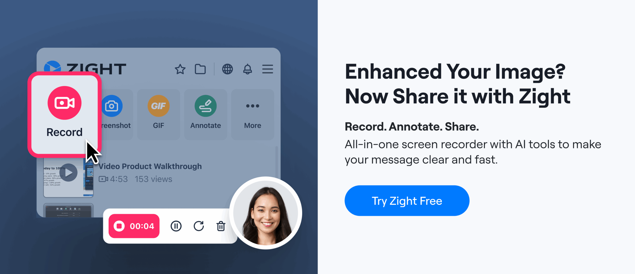
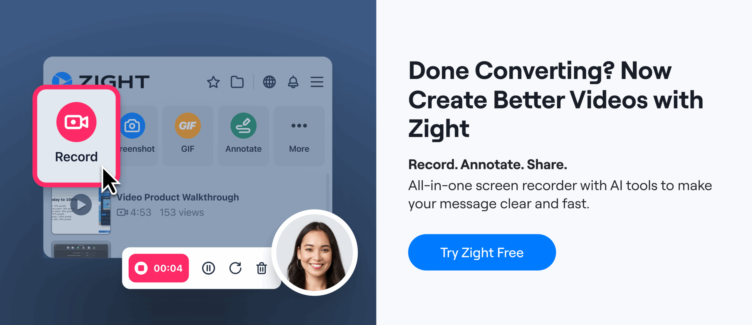
Ready to Boost Your Productivity?
Save time and money while boosting your productivity with Zight — free tools for screen recording, screenshots, GIFs, and webcam capture.
Try Zight for Free
