Your pricing page is the most important page on your site. A potential customer browses through your site, learns about your product and what you have to offer. By the time they get to the pricing page, they make a decision upon whether or not they will subscribe to your software, or carry on elsewhere.
A study from E-consultancy states that only 22% of businesses are satisfied with their conversion rates. If you want to beat the odds, focus on the little things that will convert big results. Be transparent, clear, and obvious. Make it easy to sign up because the value is so obvious. In this article, I’ll teach you how popular SaaS companies design their pricing pages to convert visitors to customers. I will also explain the psychology behind their decisions.
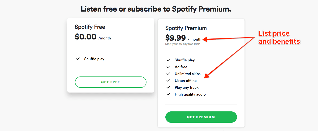
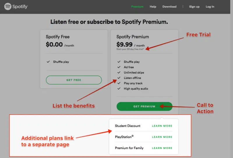
Spotify
Group the Price and Benefits
Make it clear to your audience that for X amount of dollars they will receive X amount of features. Give customers a reason to buy your product. Whenever you show a price tag, remind them why it’s a good value. Then close the sale with a call-to-action.
Link to Complex Plans
As I went further down the Spotify pricing page rabbit hole, I learned they have three secondary plans. These additional plans have unique features, benefits and pricing. Don’t cram everything onto one page. Plan and test various user flows to keep customers interested.
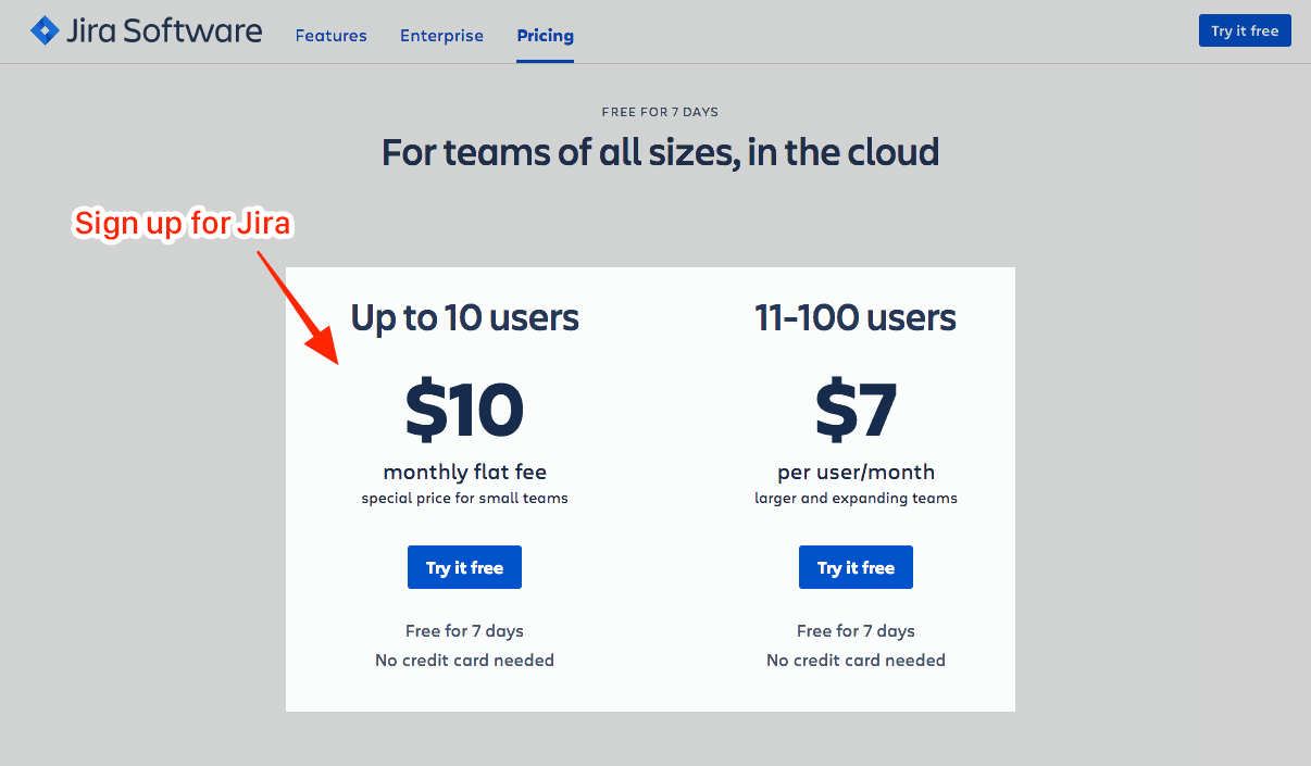
Jira (Atlassian)
Suggest an Add-on
Atlassian sells many products, including Jira, Trello, and Confluence. When you sign up for Jira, they use a method called suggestive selling to convince you to add additional products to your subscription for a low price. They even include a convincing statement that says “72% of our customers combine our products.”
On Jira’s pricing page, Atlassian uses a technique called “suggestive selling” to convince you to try additional products.
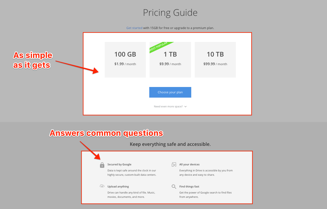
Google Drive
Keep it Simple
There’s no need to overcomplicate your page. A great user experience is written in plain language, and directs the visitor to take action based on the goals of the business. Google does an excellent job slimming down the pricing page for Google Drive. They answer all of my questions including:How much space do I get for my money? How easy is it to upload new files? Is it secure? Will it sync across all of my devices?
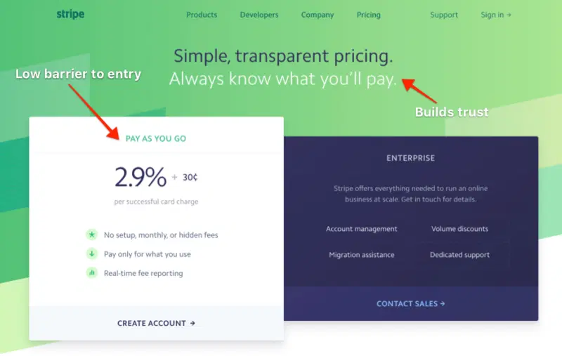
Stripe
Design a Beautiful Well-Branded Page
Thepricing page of Stripe is good-looking,easy to read, and clear. They don’t over complicate things and use color and contrast to separate two plan types: Pay as you go vs. an enterprise plan.
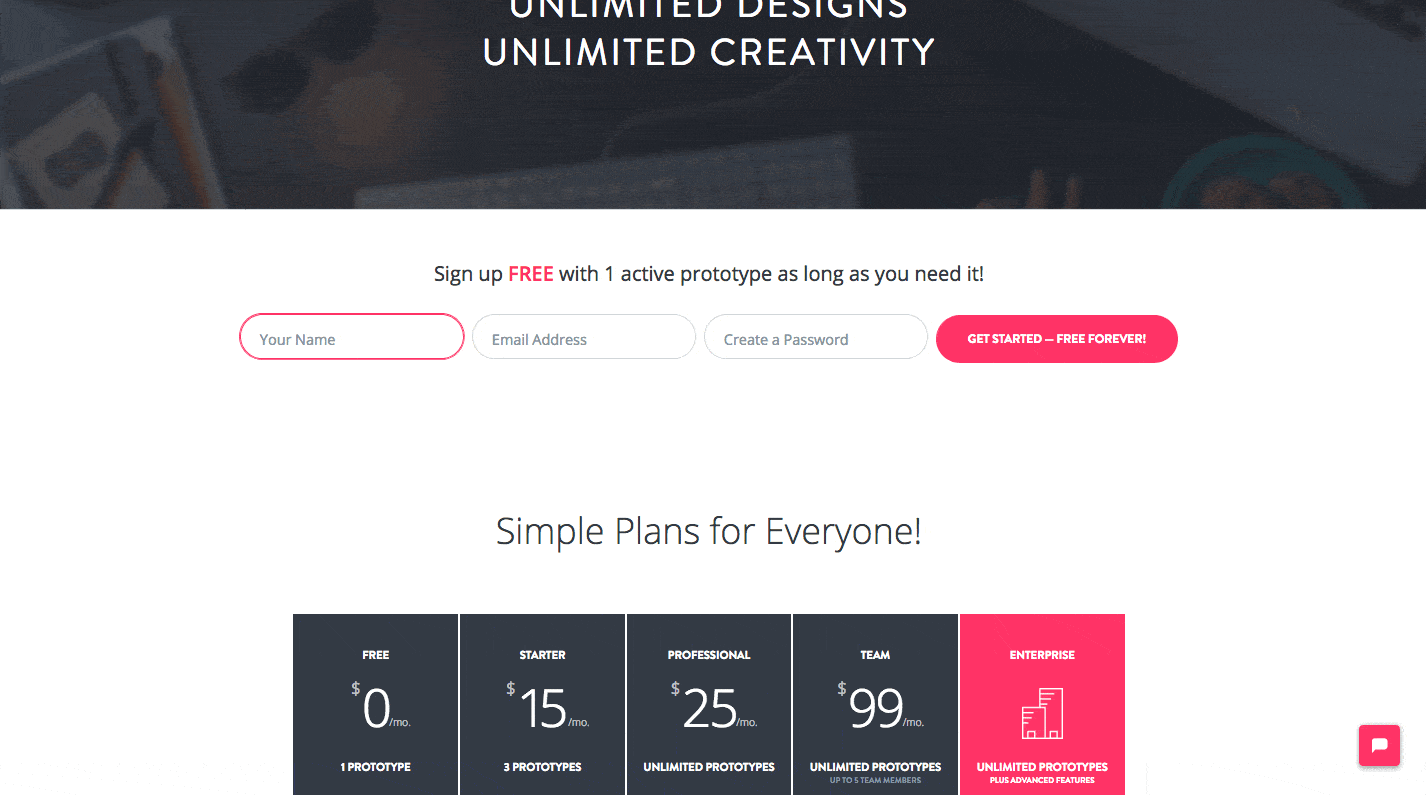
InVision
Create a quick and easy product sign-up form on your pricing page
InVision’s Pricing page is IMPRESSIVE! I have a lot of respect for InVision mainly because they know design inside and out. They pay attention to every level of the customer experience and consider all of the touchpoints.
InVision allows new customers to sign up and use their product in 1 step. You enter your name, email address, create a password, click “get started” button, and then you are immediately thrown into the product experience where you can experiment with prototyping, freehand, and explore features.
 InVision includes a quick sign up form on their pricing page to turn visitors into customers.
Design Conditional Pricing Pages
After I created a new account, I revisited Invisionapp.com/pricing and noticed the page was different. InVision uses conditional pricing pages based on the customer journey. They designed 2 pricing pages, 1 to get people’s foot in the door, and then another to upgrade their plan after signing up.
InVision designed 2 pricing pages, 1 to get people’s foot in the door, and then another to upgrade their plan after signing up.
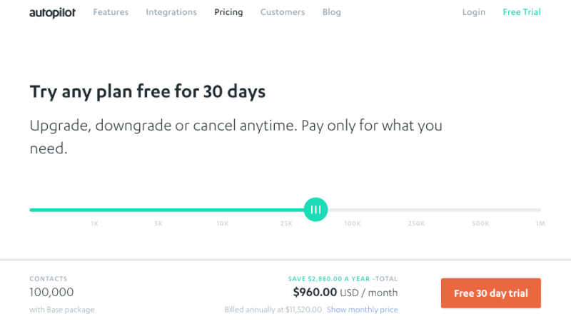
Autopilot
Use a Slider to Showcase Dynamic Pricing Options
Pricing can be complicated, but it doesn’t have to feel that way. Play with different components, and get creative. Design an interface to help the user achieve their goals.
Autopilot, a visual marketing and automation tool, includes a dynamic visual pricing slider to allow you to explore costs based on the number of contacts.
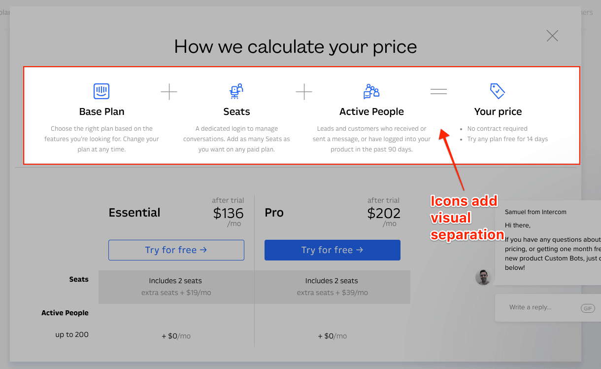
Intercom
Use Icons to Explain Your Pricing Model
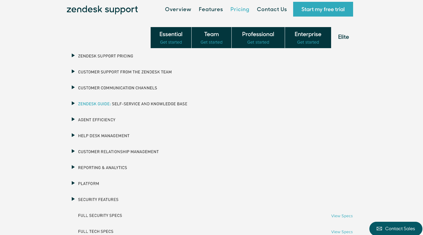
Zendesk
Expand and Collapse Large Blocks of Content
Comparison tables are common on pricing pages. It’s helpful to list features side-by-side, so the customer can choose a plan based on their needs. When you have a lot of information, try nesting content into sections.
Look at Zendesk’s pricing tables, for example. Zendesk utilizes collapsable pricing tables to focus your attention on one section at a time. At first glance, you see a general idea of available features, then you can view more by expanding sections.
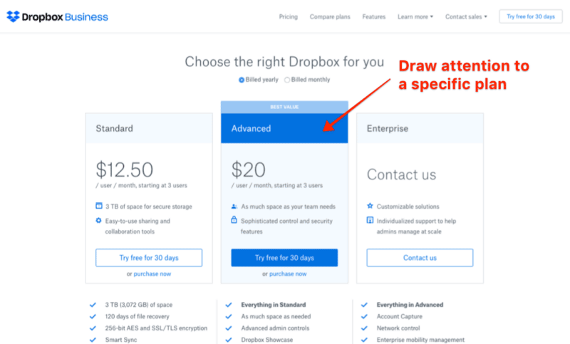
Dropbox
Highlight a Specific Plan
Make it easy for visitors to select a plan, by suggesting the most popular option.
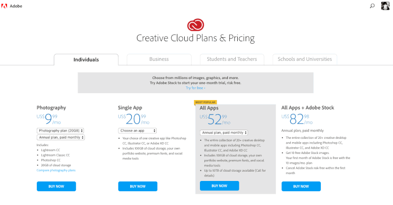
Adobe
Use Tabs to Separate Plans by Personas
Attention and time are the most valuable resources a person can offer. Show visitors that you respect their time. Separate pricing plans into personas and allow people to access the plan that makes sense to them.
~and~
Make Plans Flexible for Different Types of Users
Adobe offers a lot of options. You can subscribe to 1 app for a lower price or gain access to the entire Creative Suite for larger cost.
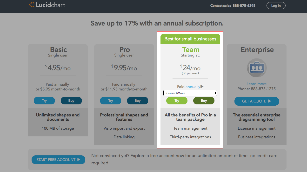
Lucidchart
Do the math for them
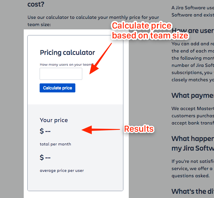
Jira (yes, again!)
Create a pricing calculator
Save time and energy for your sales reps and answer as much as you can up front. Atlassian created a pricing calculator so visitors can immediately know the costs to sign up.
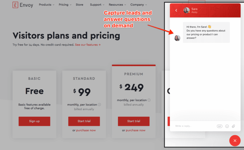
Envoy
Add an on-demand messaging service to answer questions
Convert visitors to customers with exceptional customer service. Install a messaging bot like Intercom or Drift so your sales team can answer questions on demand or reply by email at a later date.
According to Hubspot, 48% of consumers would rather connect with a company via live chat than any other mean of contact.
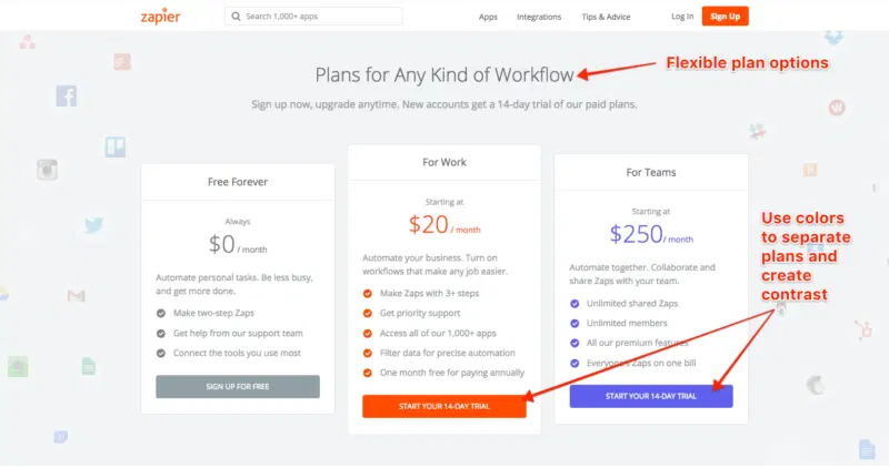
Zapier
Separate Plans with Colors
Here are a few more tips:
Always Offer a Free Trial
Many SaaS businesses offer a free trial or a free version of their product to get people in the door. At Zight (formerly CloudApp), you can use our product for free. But we’re lucky to have a large percentage of customers upgrade their plan because they want access to our extra features.
Make the Case for Someone to Upgrade
- Get clear on what you are offering
- Make sure that you are offering something of value
- People want a low price for a high-value. Always make them feel like they are receiving a lot for their money.
- Be as upfront as possible
- Be sure that the premium offers are based on user research and things users want
- Test and iterate
- Build an exceptional product
Describe what the product does, and if it’s useful and good, people will want to pay for it.
In Conclusion
If you want more sales, you have make it as easy as possible for visitors to understand your product and how it benefits them. Personas are the key to sales. Get clear on who your target audience is and speak directly to them. Always stay open to feedback, test your page, and revise until you meet your goals.
Thanks for reading and please add suggestions, questions, and comments in the section below.
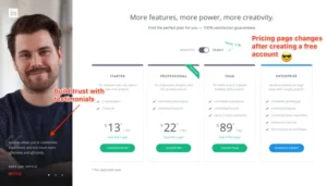
About the Author:Andi Galpern
Andi Galpern a UX Content Strategist and Product Designer at Zight (formerly CloudApp). She teaches best practices for product design, builds community, and works across the Marketing & Product Team.
Andi is also the Founder and Producer ofCascade SF, an experience design for technology organization in the Bay Area. Her events provide a go-to space for product designers to learn new skills, connect with industry leaders, mentor, and stay ahead of the job market. Everyone works together toward a more fulfilling career.
Since 2011, Andi has organized hundreds of design and technology events to bring communities together. She coaches designers to create presentations, write blog posts, and become leaders. Follow Andi on Twitter@andigalpern.