2025 is upon us! If you’re like me, you’re excited at the idea of a new year with limitless opportunity. There’s so many things to do, so many challenges ahead, and so many wonderful new experiences that await you.
But, there are also infinite ways that you could waste your time and spend your energy. The CEO of Shopify recently suggested that there are only 5 hours in a work day to be creative, and as Iread this, I thought that it made sense to limit the opportunity for distraction. For me, my iPhone is an incredible distraction machine. Text messages, notifications, Slacks, invitations, reminders, Instagram, Facebook, Spotify, and on and on and on.
Rather than allow my phone to control me, and to control my time, I wanted to be able to bend its power to my will, and to my focus. To do that, I made my iPhone home screen extremely bare bones. Here’s a quick picture to show you what I mean:

If you look closely, you’ll notice several specific things going on here:
#1 – Boring, Grayscale App Icons
The color of each app is consistently grayscale. There are no reds, no blues, really nothing that would stand out in a crowd. My app icon colors are boring! This was on purpose. I found that when I looked at my home screen, I tended to look at certain apps (Slack, Chrome, etc) because of their wild, fun colors.
Instead, I decided to get real boring.
To turn your iPhone app icons grayscale, there are two approaches you can take:
- The simplest way — You can use a feature in Accessibility mode on your iPhone. In iOS, go to Settings > General > Accessibility >Display Accommodations >Color Filters. Switch Color Filters on and select Grayscale. To easily toggle between color and grayscale, go to Settings > General > Accessibility > Accessibility Shortcut > Color Filters. You can even set up your phone so that if you were to, for example, triple click your power button the colors would change.
- The complex, but awesome way — You can use a free app from Apple in the App Store called ‘Shortcuts’ to create your own ‘Shortcuts’ to your apps. Essentially you are creating your own button, or app shortcut, that when clicked, opens one of your apps. You can then choose the color of the app icons, the symbol/icon/glyph for the app shortcut, and so on.
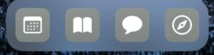
#2 – No Names, Just Icons
A feature of the iPhone ‘Dock’ is that when you put an app there, the name of the App disappears. It’s both welcome, and a little confusing, especially since the Dock is the only place on your iPhone that the app name seems to disappear. While understandable that the Dock might be the only best place to do this, I wanted it everywhere.
I found that I really loved that the icons in the dock were my main focus, and I didn’t have to actually read any of the words.
To get this result, I once again used the iOSapp ‘Shortcuts’, to create my own App Shortcuts, and while creating the ‘Shortcut’ itself, you can delete the name of the ‘Add to Home Screen’ button, and leave it as no text.
#3 – No Apps At the Top of the Screen
In addition to having small hands, Ialways found it frustrating that at the top of your screen your apps were organized, and then at the bottom of your screen, you had your ‘Dock’ apps, or what I would consider your ‘Primary’ apps. There is this gigantic disconnect between the top of your screen and the bottom. So for a guy like me with small hands, a huge iPhone screen, and a disinterest in having many apps, Ineeded a solution.
After Googling, reading Reddit forums, and realizing that I was not interested in any kind of real ‘hacks’, I discovered a website called Makeover (https://www.makeovr.io/).
This workflow is pretty crazy, and the workaround a bit unusual, but I found that it accomplished my goal of simplifying my home screen, while only taking a few minutes to set up.
Makeover essentially asks you to take a screenshot of an empty home screen page, and then turns that screenshot into app icons that are ‘Invisible’. Really they are icons with the same background you already have, so they end up overlapping and disappearing. By having an ‘Invisible’ icon on your home screen page, it takes up an App Icon slot, and pushes your apps further down so that you can organize the apps in whatever Grid like structure you want.
#4 – Consolidating Similar Apps into one click
I’ve recently noticed that I use a lot of Messaging apps. I have work messaging, family messaging, friend messaging, video messaging, and so on. To give you an example, in the last week I’ve used:
- Facebook Messenger (family messaging, and selling stuff on Marketplace)
- Marco Polo (video messaging w/ family)
- iMessage (text messages)
- Slack (work chat)
- Gmail
- Superhuman (optimized gmail)
I’m not sure I’m proud of this, but, it’s my reality.
That’s a lot of messaging apps! And while I don’t use these apps all the time, I do frequently use them, and I didn’t really like the idea of having a folder for all of my messaging apps nor did I want to have an entire page devoted to them.
My workaround was again to use the iOS Shortcuts app to create a simple shortcut to, for example, a ‘Messaging’ app that when Clicked would open up a list of various apps that I could use to send a quick message, or access one of my apps.
#5 -Use Zight (formerly CloudApp) iOS to store your screenshots for you
Clean up space in your photos by moving your screen shots to the Cloud with the Zight (formerly CloudApp) iOS app. You can also get quick access to files from your computer and access all of your other other screenshots, screen recordings, or GIFs
And that’s it !4 (relatively) simple steps to get your productivity back.
I plan to link a few of my ‘Shortcuts’ in a forthcoming update to this post.