Understanding what the Gestalt principles in advertising are, how to use Gestalt principle in design, and implementing these principles will significantly improve the aesthetics, functionality, and user-friendliness of your design.
What are the Gestalt Principles?
To begin with, what are the Gestalt principles? There are seven principles associated with Gestalt theory:
- Figure-ground
- Similarity
- Proximity
- Common region
- Continuity
- Closure
- Common fate
These seven principles define the core purpose of the Gestalt theory, which is based on the idea that the human brain is designed to simplify and organize complex images or designs consisting of several elements. The mind does this by subconsciously arranging the parts into an organized system that creates a whole, opposed to simply processing them as a series of disparate elements.
How to use Gestalt Principle in Design
Now that we’ve answered what are the gestalt principles? We can dive into the real question, of how to use Gestalt principle in design. The 7 principles work together to build a guideline intended to organize the various components of a design. Proper Implementation results in simple, clean, and memorable designs. Learn how to use Gestalt principle in design so you can master the art of design.
As with any discipline, graphic design is built on rules that help you create an effective composition that delivers a clear message to your audience. If your design or process is lacking that balance, you will be left with a weak and ineffective design. Without the basic elements and principles of design that help users intuitively understand or connect with your message, you are at a huge disadvantage over your competitors. We’ll let you in on a little secret – the best designs are simple, consistent, and clean. In this article, we will define principles of design and the 6 crucial elements and principles of design so you can master the art of design.
Gestalt principles are relatively simple to incorporate into almost any design. A quick review of Gestalt principle examples demonstrates how quickly the 7 principles will elevate a design that would otherwise appear haphazard or confusing. Transform a design with elements that are competing for a user’s attention into a design that offers the viewer a design that naturally guides them towards an action, or through a hierarchy of important elements seamlessly.
Figure-ground
The first Gestalt principle is the figure-ground principle. This principle is based on the notion that people instinctively perceive objects as either being in the foreground or the background. In other words, objects either stand out prominently in the front (the figure) or recede into the back (the ground).
In most instances, your brain will interpret the larger area of an image as the ground and the smaller image as the figure. One of the most famous examples of the figure-ground Gestalt principle examples is the famous two faces or a vase illusion developed by Danish psychologist Edgar Rubin. The illusion is created because the faces and vase are competing to be both the figure and the ground, which presents with two shape interpretations—two faces or a vase.
Needless to say, your goal shouldn’t be a design with competing components, but rather highlighting a focal point. A successful UX form, for example, utilizes the figure-ground principle to elevate their site from a purely informational platform to a powerful conversion tool. On Zillow’s site, the background fades when the popup UX form appears, so visitors can easily focus on the form. They’ve also implemented the figure-ground principle on their homepage. The search bar is at the forefront, and the photo is in the background. By implementing the figure-ground principle, your viewer will immediately know what they should focus on.
Similarity
The human eye naturally fills in the gaps or connects the dot and the brain automatically connects a link between elements of a similar nature. The principle of similarity is based on this idea. When things appear to be similar, we automatically group them together. Even if the elements in your design are separated, the human eye tends to perceive similar elements in a design as a complete picture, shape, or group. It is influenced by the shape, size, and color of the elements. When objects are mixes with high degrees of similarity with a group of dissimilar objects, the brain will work to create links between them and understand their relationship with each other.
We tend to think that elements that appear similar have the same function. They are also perceived to be in a relationship with each other, separating them from other elements in a design. Similarity can be used to tie together elements that might not be right next to each other in a design.
Similarity, as a Gestalt principle in advertising, web and interactive design, and UX design make it clear to visitors which items are alike. It can also be used to make dissimilar elements stand out. Make the most of this natural human inclination by guiding your user’s eye to elements of your design you want to accentuate, such as buttons for calls to action. They are purposefully designed in a different color than the rest of a page in order to draw the visitor’s attention to the desired action. Even small and simple aspects, such as formatting, demonstrates how to use the Gestalt principle of similarity to demonstrate the organization and structure of your site or design.
Proximity
Although similarity can be used to tie together elements that might not be right next to each other in design, proximity can override similarity of color, shape, and other elements that may cause a viewer to group objects together.
The principle of proximity is the concept that things that are close together appear to be more related than things that are spaced farther apart. Websites often use proximity to distinguish between an image, headline, description, and other information for each individual story. The space between each element and the space between each individual story can be seen as some Gestalt principle examples.
The most powerful proximity relationships are those between overlapping subjects. However, grouping similar elements close together into a single area can create a strong proximity effect. Keep in mind that the opposite is also true, so beware that putting space between elements may signal separation despite similar characteristics.
UX design often utilizes proximity to demonstrate certain elements belong together without the use of things like hard borders. Proximity quick shows the viewer the organization and structure you have created.
Common region
The principle of common region and proximity are closely related. Common region refers to the idea that when objects are located within the same closed region, we perceive them as being grouped together.
Adding borders or visible barriers will create a perceived separation between groups of objects despite the similarity in shape, color, size, etc. or proximity. One of the best Gestalt principle examples is Pinterest. Pinterest uses the common region principle to separate each pin. The photo, title, description, contributor, and other details are each viewed as individual or separate from the rest of the pins around it.
Continuity
Continuity refers to the principle that elements arranged on a line or curve are perceived to be more related than elements that are not on the line or curve. The human eye will naturally follow the smoothest path and create connects. It doesn’t matter how the lines were actually drawn, it matters what the lines and curves communicate to the viewer. It’s simple to see how to use Gestalt principle in design when it comes to continuity. Thus, it is an extremely valuable tool for designers that want to guide a visitor’s eye in a certain direction. If you want to make the most of the continuity principle, make sure the most vital parts fall within that path and thus within their line of vision.
Amazon uses the Gestalt principle in advertising with its website design layout. Continuity communicates to buyers that the list of products below are similar and related to each other. The horizontal slider, which shows related product listings, is the perfect way to draw the buyer’s eye from one item to the next.
Closure
Closure is similar to the figure/ground principle in that it takes advantage of the way the brain processes negative space. When we look at a complex arrangement of visual elements, our brains try to decipher a single, recognizable pattern. This uses the same principles as the idea in which our brains can recognize certain words, even when they are jumbled. For instance, Tehse wrods may look lkie nosnesne, but yuo can raed tehm, cna’t yuo? The same idea applies to design. When you look at an image that has missing or jumbled parts, your brain will fill in the missing information and make a complete image that creates a recognizable pattern based on your experience.
The closure principle is commonly found in logo designs at a number of well-known companies including IBM, NBC, Adobe, and Zendesk.
In its most basic form, the principle of closure allows your eye to follow something such as a dotted line to its end. In more complex applications, large chunks of the outline will be missing, but our brains will easily fill in the missing sections to see the complete image.
In UX and UI design, closure is often used by showing a partial image fading off the user’s screen to signal to them that there is more to be found if they swipe left or right. If the full image is present, the brain won’t interpret that there is more to be seen. Closure is a clever way to get users to scroll.
Common fate
Common fate is the last of the Gestalt principles in design. It was not originally included in gestalt theory, but has since been added since it’s usefulness In UX design is invaluable. This principle states is based on the idea that people group together things that appear to be moving in the same direction.
This is especially useful in UX as animated effects have become more commonplace and prevalent in design. Elements don’t need to be moving to benefit from this principle, they merely need to give the impression of motion.
Just as a photograph of a flock of birds or school of fish, our brains interpret these individual elements moving as one. Our brains automatically group them together and this concept can easily be applied to your design.
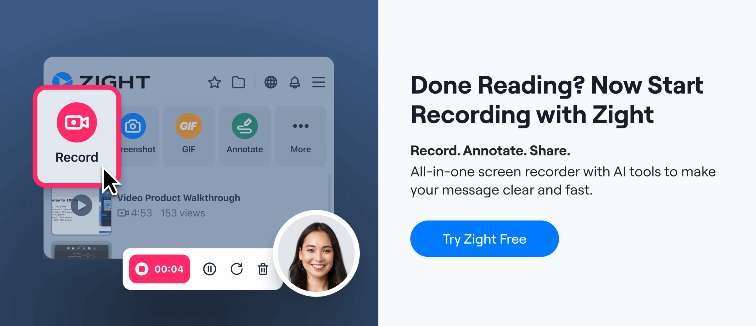
Gestalt Principles in Design with Zight (formerly CloudApp)
Creating a powerful design takes practice and a strong understanding of design tools, such properly knowing how to use Gestalt principle in design. The time you take investing in creating a simple and clean design is well worth it, so don’t underestimate the power of Gestalt principle in design. With careful attention to the 7 principles outlined in the article aboe, you will have the key to mastering the art of design.
Gestalt principles can be simply incorporated into almost any design to quickly elevate a design. Learning to incorporate the principles of Gestalt into your design work can greatly improve your approach to designing with a stronger understanding of how the human brain works. A person’s natural tendencies help create a seamless and comfortable interaction with your UX form, website, or other design, even if it’s their first time experiencing it.
At Zight (formerly CloudApp), we offer our basic features for free. Take advantage of our online design tool. Whether you work in an office, or you do a lot of remote work, Zight (formerly CloudApp) is perfect for collaboration or sharing your work. Integrate it with other tools, such as Sketch, Adobe XD, Asana, and Slack for the ultimate internal communication tool.
Zight (formerly CloudApp) is compatible with Macs and PC. Install the Cloudapp Mac App, Windows App, iOS app, or our Chrome Plugin.
0 bonus tips on how to effectively use the Gestalt principles in design and how using Zight (formerly CloudApp) can enhance this process:
1. Utilize Figure-Ground for Emphasis
Tip: Use the figure-ground principle to make essential elements stand out. For instance, in a presentation, use Zight’s screen recording feature to highlight key points while dimming the rest of the screen to focus attention. How Zight Helps: Zight’s annotation tools allow you to blur out parts of your screenshot or video, helping to create a clear figure-ground distinction.
2. Apply Similarity for Consistency
Tip: Ensure that similar elements such as buttons or icons are consistent in design to help users recognize their functionality easily. How Zight Helps: With Zight, you can create and share design templates that maintain similarity across all design elements, ensuring a cohesive look.
3. Leverage Proximity for Clarity
Tip: Group related elements together to indicate their relatedness and separate unrelated elements to avoid confusion. How Zight Helps: Use Zight’s screenshot capabilities to create mockups and show clear groupings of design elements. Share these with your team to ensure everyone understands the layout.
4. Define Common Regions for Organization
Tip: Use borders or background colors to create common regions that group elements together, making your design more organized. How Zight Helps: Zight allows you to annotate screenshots with shapes and borders, helping to visually define common regions in your design.
5. Ensure Continuity for Smooth Navigation
Tip: Arrange elements in a continuous line or curve to guide users’ eyes naturally from one part of your design to another. How Zight Helps: Create and share continuous design flow charts or UI sequences using Zight’s GIF or video recording features, ensuring a smooth visual experience.
6. Implement Closure for Visual Interest
Tip: Use partial shapes or lines that the brain can complete, making your design more engaging and intriguing. How Zight Helps: Capture and share interesting design elements that utilize the closure principle through Zight’s screen capture tools, highlighting how partial visuals lead to complete understanding.
7. Exploit Common Fate for Dynamic Elements
Tip: Group elements that move in the same direction to create a sense of unity and relatedness in dynamic interfaces. How Zight Helps: Record and share animations or transitions in your design with Zight, showing how elements move together and creating a cohesive experience.
8. Use Consistent Design Systems
Tip: Develop a design system that applies Gestalt principles consistently across all elements and interactions. How Zight Helps: Share your design system and guidelines with your team using Zight, ensuring everyone adheres to the same principles.
9. Provide Feedback with Gestalt in Mind
Tip: When giving feedback on designs, refer to specific Gestalt principles to explain why certain elements work well together or need adjustment. How Zight Helps: Use Zight’s annotation and commenting features to provide clear, principle-based feedback on shared screenshots and recordings.
10. Collaborate Efficiently
Tip: Use collaborative tools to gather input and make iterative improvements based on Gestalt principles. How Zight Helps: Zight integrates with tools like Slack and Asana, allowing you to seamlessly share your designs and get real-time feedback, making collaborative design processes more efficient.
By understanding and applying these Gestalt principles with the aid of Zight, you can create more intuitive, organized, and aesthetically pleasing designs that naturally guide users and enhance their experience.