How to Give Feedback on a Website Design in 60 Seconds (Without Writing a Single Email)
If you’ve ever tried to explain a misaligned button, a wrong hex code, or a confusing user flow by typing out a paragraph in Slack or email, you already know the pain. Knowing how to give feedback on a website design efficiently is one of the most underrated skills in product and agency work — and most people do it terribly. They write walls of text that reference “the thing on the right side, kind of near the top,” attach out-of-context screenshots, and pray the designer deciphers it correctly. The result? Revision cycles that should take a day stretch into a week.
There’s a faster way. Instead of describing what you see, show what you see. Record your screen, annotate it in real time, and share a link. The entire process takes about 60 seconds — and the designer gets pixel-level clarity on what to fix.
⚡ Quick Answer: How to Give Feedback on a Website Design
The fastest way to give feedback on a website design is to screen record yourself reviewing the site while narrating your thoughts and annotating issues directly on-screen. Zight is a screen recording, screenshot, and async video tool that lets you capture your screen, draw arrows and highlights over the design, and share an instant link — no file attachments, no long email threads. A 90-second recording replaces a 500-word email and eliminates misinterpretation. This guide walks you through the complete process step by step.
Why Traditional Website Design Feedback Is Broken
Before we get into the how-to, let’s be honest about why this problem exists. After working with dozens of design teams and agency clients, I’ve seen the same pattern play out hundreds of times:
- Email threads fracture context. Feedback lives across Gmail, Slack, Asana comments, and Google Docs. Six days later, the designer is searching three platforms to find that one note about the footer CTA.
- Text-based feedback is ambiguous. “Make the header pop more” means something different to every person in the room. Is it a font size issue? A color contrast problem? A spacing thing? Without a visual reference, the designer guesses — and guesses wrong.
- Static screenshots lose context. A screenshot of a dropdown menu doesn’t show whether it overlaps the content below, how it animates, or what happens on hover. You need motion to capture interaction problems.
- Feedback rounds multiply. When the initial feedback is vague, the first revision misses the mark, triggering a second round. We’ve seen teams at Zight use visual feedback to cut revision cycles from 3–4 rounds down to 1–2, saving an average of 5+ hours per project.
The root cause is always the same: the person giving feedback and the person receiving it are not looking at the same thing at the same time. Screen recording solves that by collapsing reviewer and designer into a shared visual experience.
How to Give Feedback on a Website Design: The Complete Step-by-Step Guide
This method works whether you’re a product manager reviewing a staging site, a client looking at a mockup in the browser, or a QA tester flagging visual bugs. All you need is a browser and Zight installed on your Mac, Windows, or as a Chrome extension.
Step 1: Open the Website or Prototype in Your Browser
Navigate to the page you need to review. This could be a live staging URL, a Figma prototype opened in presentation mode, or a production page that needs updates. If you’re reviewing multiple pages, bookmark each one so you can move through them sequentially during the recording.
Pro tip: Set your browser zoom to 100% and use a consistent viewport width (1440px is the most common design breakpoint). This ensures the designer sees exactly what you see. If the feedback is about mobile responsiveness, use Chrome DevTools (F12 → Toggle Device Toolbar) to simulate the target device before you start recording.
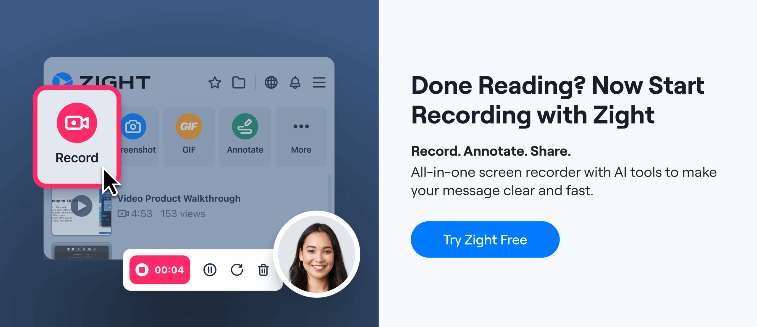
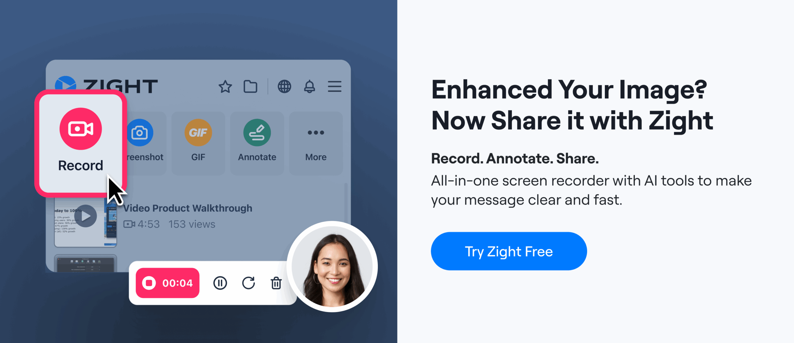
Step 2: Launch Zight and Choose Your Capture Mode
Click the Zight icon in your menu bar (Mac) or system tray (Windows), or use the Chrome extension button. You’ll see several capture options:
- Screen Record — Best for walkthroughs, interaction feedback, and reviewing multi-step flows. Use Zight’s screen recorder to capture your full browser tab or a specific region.
- Screenshot — Best for quick, static issues like color mismatches, typos, or spacing problems. Zight’s screenshot tool captures and opens the annotation editor instantly.
- GIF — Best for capturing short animation issues (a jittery hover state, a transition that feels off) when you don’t need audio narration.
For most website design feedback, screen recording with microphone audio is the most effective choice. It lets you narrate your thought process while pointing at the exact elements on screen — which is dramatically clearer than writing it out.
On macOS, the keyboard shortcut is ⌘+Shift+6 for screen recording. On Windows, it’s Ctrl+Shift+6. The recording starts after a 3-second countdown.
Step 3: Record Your Screen and Narrate Your Feedback
This is where the magic happens. Hit record, then simply talk through the page as if the designer were sitting next to you. Move your cursor to highlight the elements you’re discussing. Scroll through the page naturally. Click on interactive elements to demonstrate behavior.
Here’s a framework I’ve found works well after recording hundreds of screen sessions for design reviews:
- Start with what’s working. Spend 10–15 seconds acknowledging what looks good. This isn’t just politeness — it confirms for the designer that those elements are approved and shouldn’t be changed.
- Walk top to bottom. Move through the page sequentially rather than jumping around. This makes the recording easy to follow and ensures you don’t miss anything.
- Be specific about the problem AND the desired outcome. Don’t just say “this feels off.” Say “This heading looks like it’s 24px but the style guide specifies 28px — can we bump it up?” or “This button blends into the background — I think a higher contrast color or a drop shadow would help.”
- Interact with dynamic elements. Click dropdowns, hover over buttons, fill in form fields, resize the browser. Designers need to see what happens, not just what’s visible on load.
- Flag severity. Quickly mention whether each issue is a blocker, a should-fix, or a nice-to-have. This helps the designer prioritize without a follow-up conversation.
In practice, the difference between a text-based review and a narrated screen recording is like the difference between reading a map and having someone walk you to the destination. The designer immediately understands not just what to fix, but why it matters and where exactly it is.
Step 4: Annotate Directly on Screen While Recording
This is what separates a useful visual feedback tool for designers from a basic screen recorder. While Zight is recording, you can activate the annotation toolbar to draw directly on your screen in real time:
- Arrows — Point to the exact element you’re referencing
- Rectangles / Circles — Highlight areas that need attention
- Freehand draw — Sketch quick layout suggestions or indicate alignment issues
- Text labels — Type callouts like “wrong font” or “needs 16px padding” directly on the screen
- Numbered markers — Create a visual list that maps to your verbal feedback
When I tested this workflow against writing feedback in a Google Doc with screenshot attachments, the annotated screen recording took about 60% less time to create and — more importantly — required zero follow-up clarification from the designer. The annotations eliminate ambiguity entirely because the viewer sees exactly what you drew on exactly the element you were discussing.
Pro tip: If you’re reviewing a long page, pause between sections. Zight lets you pause and resume recording, which keeps the final video tight and easy to skim. Nobody wants to watch a 12-minute recording when the feedback could be delivered in 3 minutes.
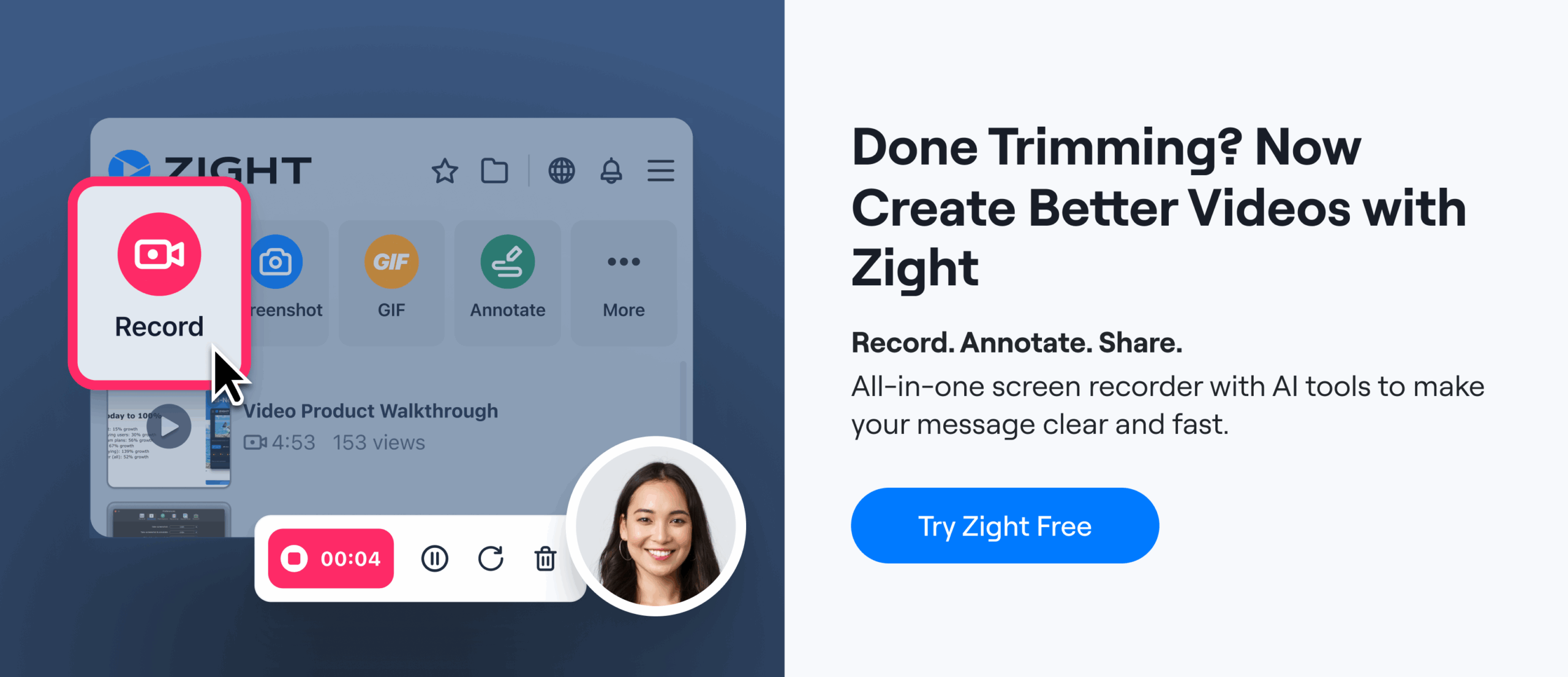
Step 5: Stop Recording and Share the Instant Link
When you’re done, click the stop button (or use the keyboard shortcut). Zight automatically uploads the recording to the cloud and copies a shareable link to your clipboard — typically within 2–3 seconds, even for a 5-minute recording.
Paste that link into Slack, email, Jira, Asana, Notion, Linear — wherever your team works. The recipient clicks the link and watches in their browser. No downloads. No large file attachments bouncing back from email servers. No “which version of this screenshot are we looking at?”
The viewer can also:
- Watch at 1.5x or 2x speed to review faster
- Leave timestamped comments on specific moments in the recording
- Scrub to the exact point where you flagged an issue
This creates a website review tool async workflow: you record when it’s convenient for you, the designer watches when it’s convenient for them, and the conversation happens in the comments thread under the recording — all in one place.
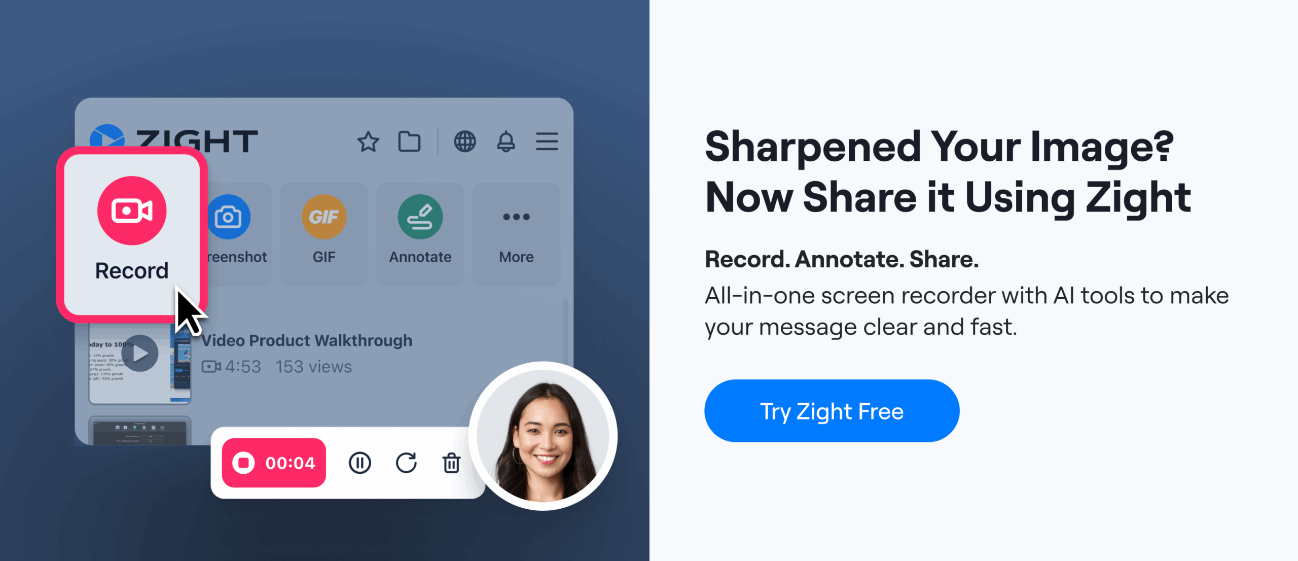
Step 6: Use Screenshots for Quick Follow-Up Items
Not every piece of feedback warrants a full recording. For isolated issues — a typo in the nav, a color that’s slightly off, a missing favicon — Zight’s screenshot tool is faster.
Capture the area, annotate it with an arrow and a text label, and share the link. The whole process takes under 15 seconds. I keep both workflows in my toolkit: recordings for comprehensive reviews, screenshots for one-off fixes that surface between review cycles.
How to Annotate a Website for Feedback: Best Practices
Knowing how to annotate a website for feedback effectively makes the difference between feedback that gets implemented correctly on the first try and feedback that spawns a 30-message Slack thread. Here are the annotation patterns that work best in practice:
| Annotation Type | Best Used For | Example |
|---|---|---|
| Red arrow | Pointing to a specific UI element | Arrow to a button with the note “CTA color doesn’t match brand guidelines” |
| Highlight rectangle | Calling out a region or section | Box around the hero section: “This entire section needs more whitespace” |
| Numbered markers | Organizing multiple issues on one page | “1. Fix heading size 2. Swap image 3. Update link URL” |
| Freehand drawing | Showing alignment or spacing relationships | Drawing a line between two elements to indicate they should be aligned |
| Text callout | Adding precise specifications | “Should be #2563EB, currently showing #3B82F6” |
| Blur / redact | Hiding sensitive data before sharing | Blurring customer names in a dashboard screenshot |
Pro tip: Color-code your annotations by severity. I use red for blockers, orange for important fixes, and blue for suggestions/nice-to-haves. After a few reviews, the designer instantly understands the priority system without you having to explain it each time.
Screen Record Design Feedback: Why Video Beats Text Every Time
If you’re still on the fence about whether to screen record design feedback or stick with written comments, here’s what I’ve observed across real design review workflows:
| Factor | Written Feedback (Email / Doc) | Screen Recording with Annotations (Zight) |
|---|---|---|
| Time to create | 15–30 minutes for a thorough page review | 3–5 minutes for the same level of detail |
| Clarity | Ambiguous — “the section below the fold” could mean multiple things | Crystal clear — you’re literally pointing at it |
| Context for dynamic elements | None — can’t show hover states, animations, or scrolling behavior in text | Full context — captures exactly what happened on screen |
| Follow-up questions needed | 2–4 clarification messages on average | 0–1 clarification messages on average |
| Reusability | Buried in email threads, hard to reference later | Shareable link with timestamp comments, always accessible |
| Emotional tone | Text can come across as harsh or blunt | Voice conveys nuance, softening critical feedback naturally |
That last point is underrated. When you’re giving constructive criticism on someone’s creative work, tone matters. A calm, conversational voice saying “I love the direction here, but I think we need to tighten up the spacing in this section” lands very differently than the same words typed in bold red text in a Google Doc. Async video humanizes the feedback process.
Who Should Use This Workflow?
This isn’t just for designers reviewing other designers’ work. The screen recording feedback workflow is most powerful when the person giving feedback isn’t a designer — because those are the people who struggle most to articulate visual problems in words.
- Product managers reviewing staging sites before launch — flag UI bugs without filing a separate ticket for each one
- Agency clients reviewing website mockups — give feedback without learning Figma’s commenting system
- Marketing teams reviewing landing page designs — show exactly how copy and visuals interact (or don’t)
- QA testers documenting visual regressions — a 30-second recording showing the bug is worth more than a 300-word Jira description
- Customer success teams relaying client feedback to design — screen record the client’s concern and share internally, preserving the original context
Common Mistakes to Avoid When Giving Design Feedback
Even with a great tool, the quality of your feedback depends on your approach. Here are the mistakes I see most often — and how to avoid them:
- Being vague about the fix. “I don’t like this” isn’t feedback. “This section feels cluttered — I think reducing the number of cards from 4 to 3 and increasing the gutter width would help” is feedback.
- Giving feedback on everything at once. If you’re reviewing a 20-page website, don’t record one 45-minute video. Record one short video per page or section. Shorter recordings get watched faster and acted on sooner.
- Mixing strategic and tactical feedback. “We should rethink the information architecture” and “this icon is 2px too far to the left” are different conversations. Separate them.
- Skipping positive feedback. If you only highlight problems, the designer doesn’t know what to preserve. Explicitly call out what’s working.
- Not sharing a link with context. When you paste the Zight link, add one sentence of context: “Here’s my feedback on the homepage hero section — 3 minutes, 4 items to address.” This increases the chance the designer watches it immediately instead of saving it for “later.”
Why Zight Is the Right Visual Feedback Tool for Designers and Teams
You could technically do this with QuickTime or the built-in macOS screen recorder (⌘+Shift+5). I’ve tried. Here’s why I stopped: macOS 14 Sonoma’s built-in recorder saves a .mov file to your desktop. You then have to upload it somewhere, generate a link, and share it. There’s no annotation layer, no instant link, no comment threads, and the file sizes are massive — a 3-minute recording can easily be 200MB+.
Zight compresses recordings intelligently (that same 3-minute video is typically 15–30MB), uploads automatically to the cloud, generates a shareable link in seconds, and lets the viewer leave timestamped comments. The annotation tools are available during recording, not as a separate editing step. It’s the difference between a purpose-built tool and a general-purpose workaround.
That said, Zight’s video editor is not a replacement for Premiere or Final Cut. If you need to add transitions, background music, or complex multi-track editing, use a dedicated video editor. Zight is built for fast, functional communication — not post-production.
For the specific use case of giving feedback on website designs, Zight hits the sweet spot: fast enough that you’ll actually use it (instead of falling back to text), powerful enough that the feedback is unambiguous, and integrated enough that the link works everywhere your team already communicates.
Frequently Asked Questions
What is the best way to give feedback on a website design?
The most effective way is to screen record yourself reviewing the website while narrating your feedback and annotating the screen with arrows, highlights, and text callouts. This eliminates the ambiguity of written feedback and shows the designer exactly what you’re referring to. Tools like Zight let you record, annotate, and share a link in under 60 seconds, cutting feedback time by 60–80% compared to email-based reviews.
How do you annotate a website for feedback without using Figma or InVision?
You don’t need to use the original design tool to give feedback. With Zight, you can annotate any website directly in your browser — whether it’s a live staging site, a production page, or a prototype. Take a screenshot or start a screen recording, then use the built-in annotation tools (arrows, rectangles, text labels, freehand drawing) to mark up exactly what needs to change. The feedback is tied to what the user actually sees in the browser, not a design file.
Can I use Zight as an async website review tool for client feedback?
Yes. Zight is specifically designed for asynchronous communication. You record your review when it’s convenient for you, share the link with your client or team, and they watch it on their own schedule. Viewers can leave timestamped comments directly on the recording, creating a threaded conversation tied to specific moments in the video. This is especially valuable for agency-client relationships across time zones.
Is screen recording better than written feedback for design reviews?
For most design feedback scenarios, yes. Screen recordings capture visual context, interaction behavior, and reviewer intent simultaneously — something written feedback can’t do. In our testing, screen-recorded feedback generated 70–80% fewer follow-up clarification questions compared to written feedback. However, for very simple issues (a single typo or a hex code correction), a quick annotated screenshot may be more efficient than a full recording.
What should I include in a website design feedback recording?
A good design feedback recording should include: (1) a brief acknowledgment of what’s working well, (2) a top-to-bottom walkthrough of the page with specific issues called out, (3) annotations pointing to exact elements, (4) a clear description of the desired outcome for each issue, and (5) severity indicators so the designer knows what to prioritize. Keep recordings under 5 minutes per page — if you have more feedback, split it into multiple recordings.
Start Giving Clearer Design Feedback Today
The best feedback is the feedback that gets implemented correctly on the first try. No follow-up questions. No misinterpretation. No wasted revision cycles. That’s what happens when you stop describing problems in text and start showing them on screen.
Zight gives you everything you need to record your screen, annotate in real time, and share a link in seconds — whether you’re reviewing a homepage redesign, a new product page, or a client’s staging site. It works on Mac, Windows, and Chrome, and it integrates with the tools your team already uses.
Try Zight’s screen recorder free and give your next round of design feedback in 60 seconds instead of 60 minutes. Your designers — and your project timelines — will thank you.
Based on testing and workflows by the Zight team. Last updated: 2024.