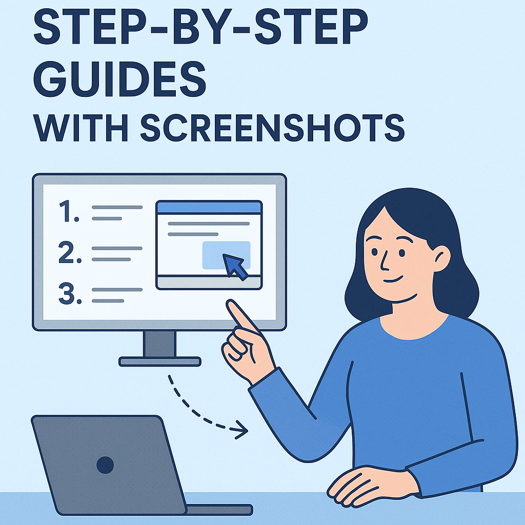
How to Create Step-by-Step Guides with Screenshots
- Start with a goal: Define what your guide should help users achieve, like completing a task in 10 minutes.
- Know your audience: Beginners need detailed steps and screenshots, while experts may only need highlights.
- Use screenshots effectively: Keep them clean, consistent, and annotated to show exactly where to click or focus.
- Organize logically: Number steps, group related actions, and keep formatting consistent.
- Make it accessible: Use clear fonts, high-contrast text, alt text for images, and test guides on mobile and desktop.
- Leverage tools like Zight: Capture, annotate, and share screenshots while maintaining your brand’s look.
How to Create a Step-by-Step Guide
Plan Your Guide and Know Your Audience
Creating an effective step-by-step guide starts with solid planning. Without it, even the most polished guide can fall short of meeting your readers’ expectations.Set Clear Goals for Your Guide
Every guide should have a clear purpose. Start by defining what you want to achieve. Are you training new employees, solving a common problem, or introducing users to new features? Each goal requires a different level of detail and approach. To make your goals actionable, use the SMART framework – specific, measurable, achievable, relevant, and time-bound. For example, instead of saying, “help users understand the software”, aim for something like, “enable new users to complete their first project setup within 10 minutes.” Writing down this primary goal will help you stay focused and track your progress effectively. Break the process into smaller, manageable steps. Create an action plan with clear deadlines for each phase – research, capturing screenshots, writing, and reviewing. This approach keeps you on track and prevents you from getting bogged down by unnecessary perfectionism.Match Your Audience’s Needs
Understanding your audience is key to turning a generic guide into a valuable resource. Conduct an audience analysis to tailor your content. This means considering your readers’ knowledge level, expectations, and preferences so you can adjust your language, tone, and content accordingly. Start by identifying your audience segments. Are they industry experts fluent in technical jargon, or beginners who need every step explained? For instance, a guide for software developers might use concise language and assume familiarity with industry terms. On the other hand, a guide for small business owners learning a new tool might require detailed explanations and visual aids. Think about creating audience personas based on real user data. These personas could include details like job roles, technical experience, and goals for using your guide. This helps you structure your content in a way that aligns with their needs – whether it’s onboarding materials or troubleshooting instructions. For beginners, include step-by-step explanations and plenty of screenshots. For advanced users, focus on unique or complex steps, skipping over the basics they likely already know.Use U.S. Formatting Standards
Consistency in formatting adds professionalism and clarity to your guide. Sticking to U.S. standards helps make your guide feel familiar and reliable. Follow a style guide to ensure your communication remains clear and consistent. For example:- Use the MM/DD/YYYY format for dates (e.g., 12/24/2025, not 24/12/2025).
- Display currency with the dollar sign before the number, using commas for thousands and a period for decimals (e.g., $49.99, $1,250.00, or $15,000).
- Indicate temperatures in Fahrenheit (°F).
- Use imperial units like feet, inches, pounds, and gallons.
- For time, adopt the 12-hour clock with AM/PM (e.g., 2:30 PM instead of 14:30).
Take Clear, Professional Screenshots
Good screenshots are essential for creating guides that are easy to follow. They should be sharp, focused, and directly tied to the steps you’re explaining.Prepare Your Screen Before Taking Screenshots
Before you start, tidy up your desktop by closing unnecessary apps, tabs, or windows that might distract from the content you’re capturing. Make sure the window you’re capturing fills the screen. You can maximize it and zoom in using Command + Plus (Mac) or Ctrl + Plus (Windows) to make the content easier to see. For crisp, high-quality images, set your screen resolution to a high setting. Windows users can also enable the “Fix scaling” option in the Advanced scaling settings to avoid blurry visuals. Lastly, keep your mouse pointer away from key areas of the screen to maintain a clean, professional look.Screenshot Best Practices
Consistency is key to creating a polished guide that feels professional and trustworthy. Frame each screenshot to include enough context while avoiding unnecessary clutter. Keeping the dimensions consistent across all images adds a clean, uniform appearance. Make sure to highlight important areas in your screenshots. Whether it’s a button, a menu, or a field, drawing attention to these elements ensures readers can quickly grasp the steps. It’s also smart to test your screenshots on multiple devices. What looks perfect on a desktop might be too small or unclear on a mobile device, so check that your images display well across different screen sizes. Using a dedicated tool can make it easier to follow these best practices.Use Zight for Easy Screenshot Creation
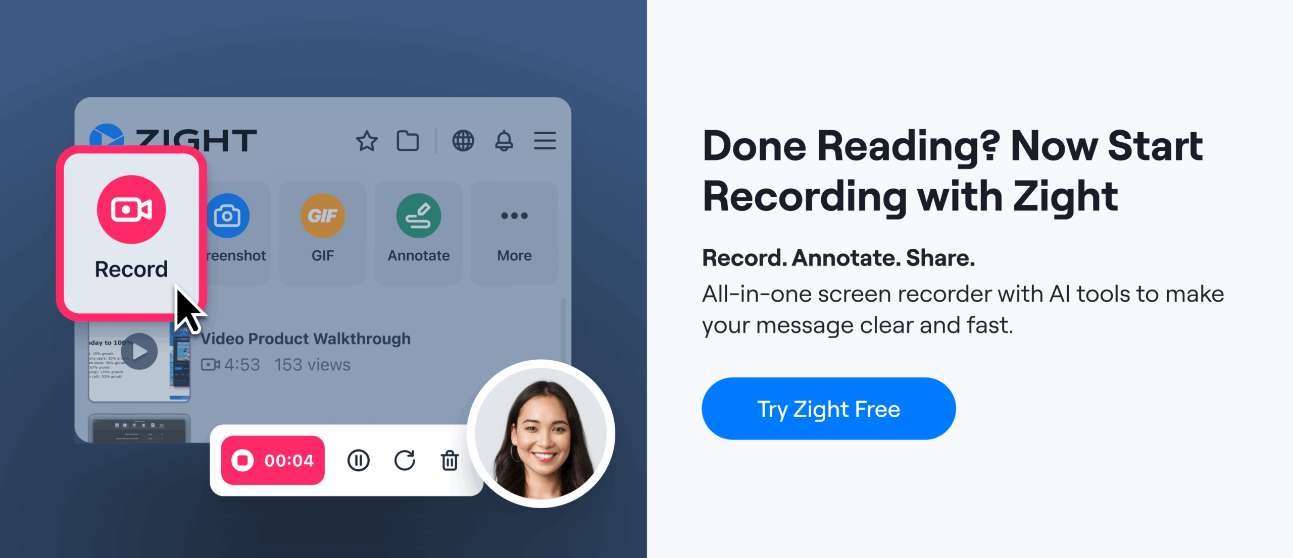
 Zight makes taking and organizing screenshots straightforward. It offers flexible capture options, such as full-screen or partial screenshots, to suit your guide’s requirements. With support for Mac, Windows, Chrome, and iOS, Zight ensures smooth performance across platforms. Its cloud storage feature automatically saves your screenshots, helping you stay organized by sorting them into folders, tags, or categories. Zight supports popular file formats like .jpg, .jpeg, .png, .tiff, and .gif. It also includes tools for creating GIFs and recording screens, which can add dynamic visuals to your guides. Plus, it integrates with productivity tools like Slack and Microsoft Teams, making it simple to share your content with teams or users.
 Add Annotations and Organize Your Screenshots
With your screenshots ready, take the next step to make your guide more user-friendly: add annotations and organize the visuals for clarity. Raw screenshots often fall short in telling the full story. By enhancing them with annotations and arranging steps logically, you can turn simple images into clear, actionable instructions that guide readers seamlessly.Add Annotations to Highlight Key Details
Annotations are essential for drawing attention to critical elements in your screenshots. They help clarify your instructions and ensure users focus on the right areas.- Text blocks: Add detailed instructions directly onto the screenshot, placing them near the relevant section without obstructing important interface elements.
- Arrows: Use arrows to point out buttons, menu items, or specific fields. Numbered arrows or callouts work well to show sequences when multiple steps are involved.
- Callout boxes: These are great for emphasizing key elements without covering crucial details. If they seem too bulky, arrows alone can guide attention effectively.
- Color-coding: Assign specific colors to different types of information. For instance, use red for errors or warnings, blue for new features, and green for successful actions. This system makes it easier for readers to identify the purpose of each annotation at a glance.
- Shapes: Circles or squares can be drawn around buttons, fields, or menus to highlight areas of interest.
Arrange Steps in Logical Order
After adding annotations, it’s time to organize your screenshots into a logical sequence. A well-structured flow ensures readers can follow along without confusion. Each step should naturally lead to the next, creating a smooth learning path.- Number your steps: Sequential numbering helps readers track their progress and makes it easy to find specific instructions later. Pair each step with a concise explanation of what the screenshot shows.
- Maintain consistent formatting: Use the same font sizes, colors, and annotation styles throughout the guide. This creates a polished, professional look and minimizes distractions.
- Group related actions: Keep similar tasks together before transitioning to a new screen or section.
- Provide context: Go beyond just explaining what to do – clarify why each step matters. This helps readers understand the bigger picture and builds confidence in following the instructions.
Follow U.S. Writing Standards
Your guide’s language should reinforce its visual elements, ensuring that annotations and instructions are easy to understand. Consistency in language is key.- Stick to American English spelling and terminology. For example, use “color” instead of “colour” and “organize” instead of “organise.” These details maintain a professional and standardized appearance.
- Use clear, straightforward language. Avoid overly complex words or technical jargon. When you must use technical terms, include brief explanations to keep things accessible for all readers.
- Be consistent with terminology. If you call something a “dashboard” in one step, don’t switch to “control panel” later. Consistency reduces confusion and helps readers stay focused.
sbb-itb-5d91f01
Build and Format Your Complete Guide
Once your screenshots are annotated and arranged in order, the next step is bringing everything together into a polished, user-friendly guide. By combining these visuals with clear, consistent instructions, you create a resource that guides users smoothly from start to finish. A well-structured guide connects the dots between detailed visuals and straightforward steps, making it easy for readers to follow along.Use the Same Formatting Throughout
Consistency is the backbone of any professional guide. When formatting stays uniform, readers can focus on the content rather than adjusting to changing styles. This makes the guide easier to navigate and more effective. Start by using clear, descriptive headers that outline what each section covers. Stick to a consistent header hierarchy – if you’re using H2 for main sections, keep that pattern throughout. These headers should be specific enough for someone skimming the guide to quickly locate the information they need. Choose a single, easy-to-read font like Arial or Helvetica, and stick with the same size for all body text – 14 to 16 pixels works well for readability. Use bold text sparingly to highlight key points, warnings, or step numbers. Overusing bold can dilute its impact, so save it for the most important details. Your screenshots should follow the same size and style rules you’ve established earlier. For instance, dialog boxes should have consistent dimensions, and full-screen captures should maintain the same resolution and aspect ratio. This uniformity creates a professional, polished feel. Don’t overlook margins, white space, and indentation. These small details can make a big difference, giving your guide a clean, intentional look rather than an unorganized one.Make Your Guide Accessible to Everyone
Accessibility isn’t just a nice-to-have – it ensures your guide can be used by the widest possible audience. And when you design with accessibility in mind, you often improve the experience for everyone. Start with font size and contrast. Text should be large enough to read without zooming, and there should be enough contrast between the text and background for easy readability. Dark text on a light background is usually the most effective. Avoid relying solely on color to communicate important information. For example, if you highlight errors in red, also use bold text or an icon to ensure the message is clear for all users. Add image descriptions to every screenshot. Alt text should explain what the image shows and why it matters. Instead of writing something vague like “screenshot of dashboard”, go for something more specific, such as “dashboard with the Analytics tab selected and three report widgets displayed.” This level of detail ensures that users who can’t view the image still understand its context. Keep your language simple and direct. Avoid unnecessary jargon, and if you must use technical terms, provide a brief explanation. This approach makes your guide more inclusive and easier to follow, even for those less familiar with the subject. Ensure your images are optimized for different devices. Test your guide on both desktop and mobile screens to confirm that screenshots are clear and don’t require excessive scrolling or zooming. High-resolution images that scale well and load quickly are ideal for a seamless user experience.Use Zight’s Sharing and Branding Tools
Once your guide is formatted, Zight’s tools can help you maintain a professional look and simplify sharing. These features ensure your content aligns with your brand and reaches the right audience effectively. With custom branding, you can add your logo, use your brand colors in annotations, and tailor the overall design to match your organization’s identity. This attention to detail reinforces your brand and leaves a strong impression on users. Zight’s sharing controls give you flexibility in how you distribute your guide. Whether you need public links for wide access, password-protected links for sensitive content, or restricted access for specific team members, you can manage who sees what. This level of control ensures your guides are shared securely and appropriately. The platform’s team collaboration features make it easy to keep guides up to date. As software or processes change, multiple contributors can work together to refine and update the content. This ensures your guides remain accurate and relevant over time. Finally, analytics and tracking provide valuable insights into how your guides are being used. You can see which sections get the most attention, identify areas where users might struggle, and track overall engagement. This data helps you refine future guides and pinpoint areas that need more clarity. Investing time in formatting and accessibility doesn’t just make your guide look better – it also improves user satisfaction and reduces support requests. A well-organized guide with consistent styling, clear instructions, and thoughtful accessibility features ensures your users can achieve their goals with ease.Review, Complete, and Share Your Guide
Once your guide is finished, take the time to review it thoroughly and test it with real users. This ensures your guide is accurate, clear, and effective. The final step is to share it strategically, making it accessible to the right audience.Check and Test Your Guide
Before hitting “publish”, make sure every step in your guide works exactly as described. This means carefully reviewing the instructions and ensuring that any visuals, like screenshots, align with the current interface. Start by following your own guide step by step. This helps confirm that the instructions are accurate and that nothing has been overlooked. Pay special attention to screenshots – software updates can change layouts, button placements, or menu options. If anything looks different from your screenshots, update them before publishing. Test your guide with real users who reflect your target audience. Avoid using experts, as they might instinctively fill in gaps that others wouldn’t notice. Instead, work with individuals who match the skill level of your intended readers. Watch where they pause, ask questions, or make mistakes. These moments highlight where your instructions might need more detail or additional screenshots. During this review, check for inconsistencies, unclear language, or missing steps. Are there technical terms that need explaining? Are there abrupt transitions between sections? Even small errors in formatting or language can confuse readers and reduce the guide’s effectiveness. Feedback from users is a goldmine for improvement. Treat it as an opportunity to refine your guide, not as criticism. This iterative process ensures the final version is polished and serves its purpose. For example, a customer service representative might struggle with a setup step that feels obvious to an IT expert, while advanced users might prefer shortcuts that could overwhelm beginners. Once your guide is accurate and user-friendly, it’s time to share it with your team or audience.Share Your Guide with Teams and Users
After testing and finalizing your guide, Zight offers tools to help you distribute it effectively and gain insights into its performance. These features ensure your guide reaches the right audience and remains useful over time. Zight’s custom branding options let you create a professional, polished look. Add your company logo, use a custom domain, and tailor calls-to-action, comments, and reactions to align with your brand’s style. This consistency strengthens trust and reinforces your organization’s identity.“One of the easiest to use and share screen sharing services ever. I love the fact that I can take a branded walk-through video, and then share the video screen record grab, and then brand the landing page with my company logo. LOVE love love the branding.” – Bruce Kraft J., Marketing, Operations, and Development, Beck Computer Systems Inc.Zight also lets you control access and interactions with your guides. For example, you can set expiration dates for sensitive content to prevent outdated information from circulating. Adjust access levels based on your audience – use public links for customer-facing guides or restrict access for internal training materials. Analytics tools provide insights into how your guide is being used. With Zight, you can track who views your content, how often it’s viewed, and how much of it is read. If users frequently stop at a particular step, that section might need to be clarified or simplified. On the flip side, high engagement in certain sections can inform future updates or new guides. To keep improving, collect ongoing feedback through surveys, beta testing, or direct observations of users interacting with your guide. Establish channels for users to report issues or suggest enhancements. This continuous feedback loop ensures your guide stays relevant as software or processes evolve. Zight’s integrations with tools like Slack and Microsoft Teams make sharing even easier. Team members can access guides directly from the platforms they already use, streamlining adoption and reducing friction. Finally, keep your desktop app updated for the latest security features. This is especially important when sharing guides that include sensitive information. Regular updates ensure you’re using the most secure and feature-rich version of the platform.