/*! elementor – v3.8.1 – 13-11-2022 */
.elementor-heading-title{padding:0;margin:0;line-height:1}.elementor-widget-heading .elementor-heading-title[class*=elementor-size-]>a{color:inherit;font-size:inherit;line-height:inherit}.elementor-widget-heading .elementor-heading-title.elementor-size-small{font-size:15px}.elementor-widget-heading .elementor-heading-title.elementor-size-medium{font-size:19px}.elementor-widget-heading .elementor-heading-title.elementor-size-large{font-size:29px}.elementor-widget-heading .elementor-heading-title.elementor-size-xl{font-size:39px}.elementor-widget-heading .elementor-heading-title.elementor-size-xxl{font-size:59px}
One of the first steps in website design is to create a hero image. The intention behind the hero image is to visually showcase an overview of the site’s most essential content.
Typically speaking, a hero image usually consists of images and text. This can either be static or dynamic, such a rotating list of images. Depending on the purpose of site, the content presented will vary. In an effort to create a more personalized experience for users, designers may opt for animated hero images, including videos, sliders or carousels. This is meant to entice users immediately, and creates a more crafted experience. In other cases, the hero image may showcase relevant news about the site. It all depends on your audience.
The bottom line is, a hero image should make a good first impression and capture the user’s attention. But what really makes for an outstanding hero image are ultimately hero image designs that convert users into customers. When embarking on designing a great hero image, it can feel overwhelming. Check out our curated list of best practices and examples of the best hero image designs to help you create hero image designs that convert.
Source: Spotify
What is a Hero Image?
So let’s start with the absolute basics: what is a hero image? Well, it’s the first image, main photo, or graphic that you see at the top of a webpage or email. When a visitor lands on your site, or opens your newsletter, the hero image typically shows up.
Since this usually the first visual element the visitor will encounter on the site, you want to make a lasting impression that hooks your visitors. According to Conversion Xl, it takes just 50 milliseconds for users to make up their mind about a website. Think about a site that you frequent for examples of the best hero image designs. After pursuing a few of your favorites, you’ll recognize how common it is to encounter that large web banner image, which is prominently placed on a web page, front and center, to entice visitors. If that isn’t proof enough that it’s still going strong, then stay with us to end and see if you’re convinced then.
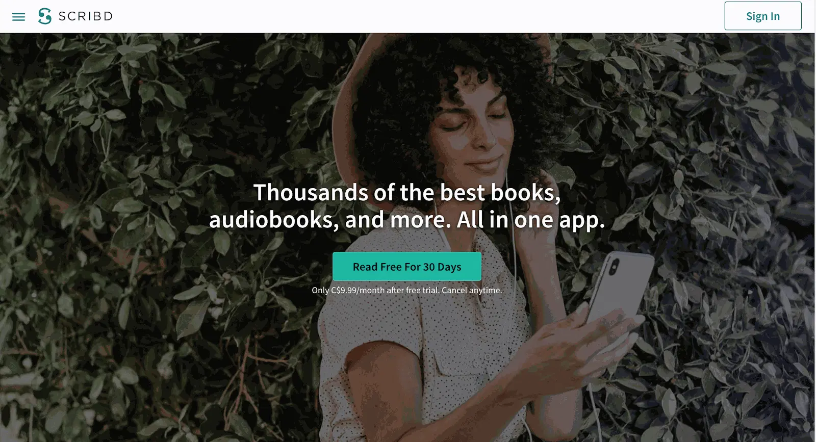
But why is the hero image so popular? The first thing that captures a visitor’s attention when they land on a site are the visuals. What they see directly influences how a user feels about the brand behind the site. Hero images are commonly used to quickly establish trust among new visitors. Hero image designs that convert those visitors into customers means the hero image has done its job, and those visitors understand, trust, and support the brand messaging.
Source: Scribd
How to Design a Website Hero Image
Okay, so that all sounds great, but then the real work is in understanding how to design a website hero image.
Choosing the right hero image
It might go without say, but choosing the right images, in high-resolution is essential. A crisp visual will go much further than a fuzzy, low-resolution image or video. Customize the size so it fits and find a balance of powerful, dynamic, warm, and inviting. If you’re placing text over an image, make sure the background isn’t too loud or busy. The best way to create an appealing visual is to create a color contrast.
One way to do this is to play with the saturation, contrast, temperature, and so forth to enhance warmer or cooler tones.
When you’re in the designing process, take advantage of Zight (formerly CloudApp)’s online design tool to gain feedback. This tool allows you to create and share high-quality visuals, and collaborate throughout the entire creative creation process.
Appeal to your audience and express your message
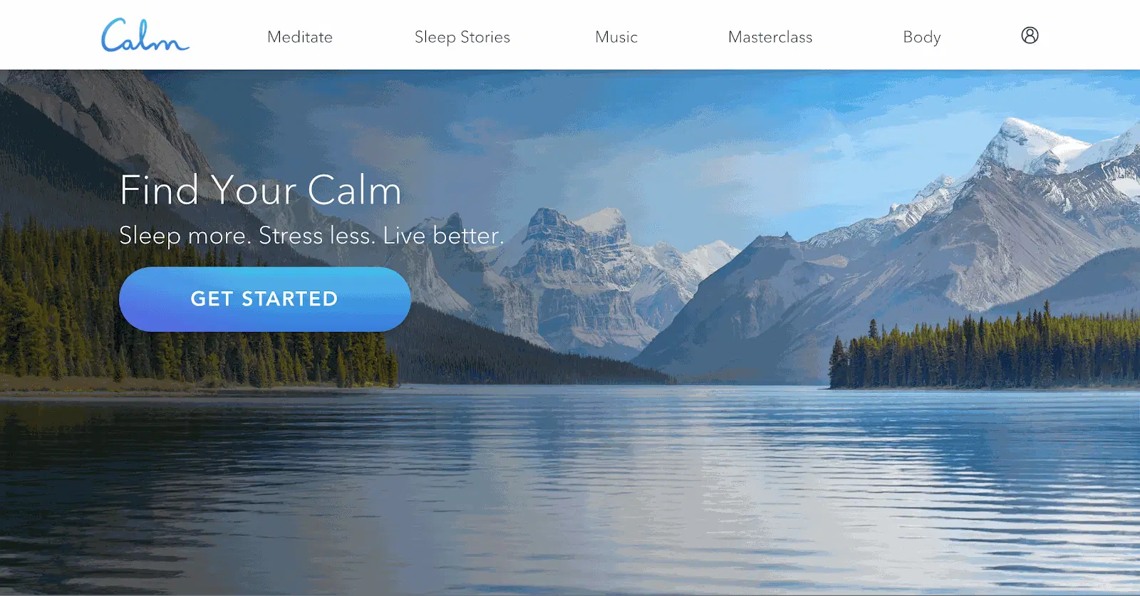
The point of your hero image is to quickly showcase your brand, so that means choosing an image and text that accurately represent your brand. If you’re selling specialty mugs, choose a photo that accurately reflects a situation where your target audience could picture themselves using that mug. Pair this with a simple call to action that gets straight to the point, and you’ve got the ingredients for a great hero image. It’s essential that your caption is accurate, targeted and in line with your hero image to make an impression.
Source: Calm
Test your hero image
Once you’ve designed a hero image, you need to expose it to the world, or at least expose it to a few users. Otherwise, how will you know it meets a user’s expectations? Simply put, you can’t! It’s important not to get discouraged at this stage as testing is all about trial and error that may need several stages of revisions. It’s intended to find how effective the hero image actually is, whether it meets its intended purpose, and if you have hero image designs that convert. With the right tools, you’ll get invaluable insight based on direct input and real user interaction.
It’s important to note when designers are working closely on a project, they may be too close to recognize what needs to be improved. The solution could be right in front of your eyes, but you might not be able to pinpoint it. Testing allows designers to take a step back in order to measure the success or pain points real users experience.
With Zight (formerly CloudApp), you have the option of conducting testing remotely. This can be moderated or unmoderated. Zight (formerly CloudApp)’s GIF screen recording feature makes it super simple to communicate and share your screen recording without having to upload it to a third platform. Once you complete your video or webcam recording, a link is automatically copied to your clipboard that can be password protected and set to expire after any desired length of time.
Hero Image Designs That Convert: Best Practices
Okay, so you’ve got a few basics, now let’s get into the nitty-gritty of best practices for hero image designs that convert. Reviewing hero image designs that convert, and checking out examples of the best hero image designs is a great place to start. What hero images have you been drawn towards as a user, and which ones have completely missed the mark?
Leading with lines
Perhaps you’ve come across the term, ‘leading lines’. The technique is exactly as it sounds. It refers to lines that guide a user’s eye to certain points of the page or design.
Leading with lines can be applied subtly, or more boldly, depending on the brand and design. Consider using lines to guide a user’s eye around your design! This can help draw the eye around the entire design, from the image, header, logo and finally to the call to action before taking that action. When using an ai logo maker, you can incorporate leading lines into your logo design to ensure it stands out and effectively directs attention.
Balance
Balance is all about visual stability and our physical sense of balance. Symmetrical designs create balance by using elements and principles of design of equal weight on each side of an imaginary center line. Asymmetrical balance uses elements of varying weights which are typically laid out in relation to an imaginary line elsewhere within the overall design. Asymmetrical designs tend to be bolder and can bring real visual interest and movement to your design.
Some elements are heavy and catch the eye, while other elements are lighter. The way you choose to layout elements in your design should create a feeling of balance. Don’t crowd your hero image design by placing a lot of heavy elements in one area of your composition, as it will throw off your balance and cause your audience to feel as if their eyes are sliding off the hero image.

Source: Netflix
Make an impact with color
Humans are visual creatures, which is exactly why it’s beneficial to understand and utilize colors. Color directs our attention. It influences where to look, what to do, and how to interpret something. Colors have the capacity to evoke an emotional bond, but each color will evoke different reactions and emotions within them. Contrasts will reduce eyestrain and allow readers to focus their attention on specific items. Vibrancy, on the other hand, dictates an emotional response. Use the color wheel to choose the best color combinations to help make your call to action buttons, text, or key elements in your hero image to stand out and appeal visually to users.
Needless to say, tapping into the psychology of color and knowing how to select the right colors is imperative to your success. Surveys found 93 percent of buyers focus on the visual appearance when they are considering a product, and over 80 percent cited that color is a primary reason that they make a purchase. Subconsciously, we associate different colors with a different set of emotions and reactions, outlined in the article, The Powerful Psychology of Color in Advertising.
There are tons of other ways to create hero designs that convert, and resources that showcase examples of the best hero image designs to inspire you. It all depends on your brand, the audience, and the action you wish your visitors to take. From experimenting with texture, borders, patterns, or gradients, to extremely minimalistic designs – there are tons of practices and tools to implement that all depend on your audience and purpose.
How to Design a Website Hero Image with Zight (formerly CloudApp)
Tailor your hero image and ensure you’ve captured your users’ attention. Hero image designs that convert encourage users to keep coming back, fit the brand, fulfill the business needs, boosts conversions, and makes a lasting impression. Get clear on who your target audience is so you can speak directly to them. We also recommend always staying open to feedback, testing your regularly, and revising it to ensure you continue to meet your goals.
We get it, effectively implementing the guidelines of how to design a website hero image that converts is easier said than done! Carefully review examples of the best hero image designs to get a better idea of what might help boost conversion.
Instantly test the effectiveness of your website hero image with others and get invaluable insight based on direct input and real user interaction with Zight (formerly CloudApp). Comparing slightly tweaked variations is one of the best ways to design the most optimal hero image and get concrete data on which variation attracts more customers. Simple changes can help you analyze different results and optimize accordingly.
At Zight (formerly CloudApp), we offer our basic features for free. Take advantage of our online design tool. Whether you work in an office, or you do a lot of remote work, Zight (formerly CloudApp) is perfect for collaboration or sharing your work. Integrate it with other tools, such as Sketch, Adobe XD, Asana, and Slack for the ultimate internal communication tool.
Zight (formerly CloudApp) is compatible with Macs and PC. Install the Cloudapp Mac App, Windows App, iOS app, or our Chrome Plugin.


