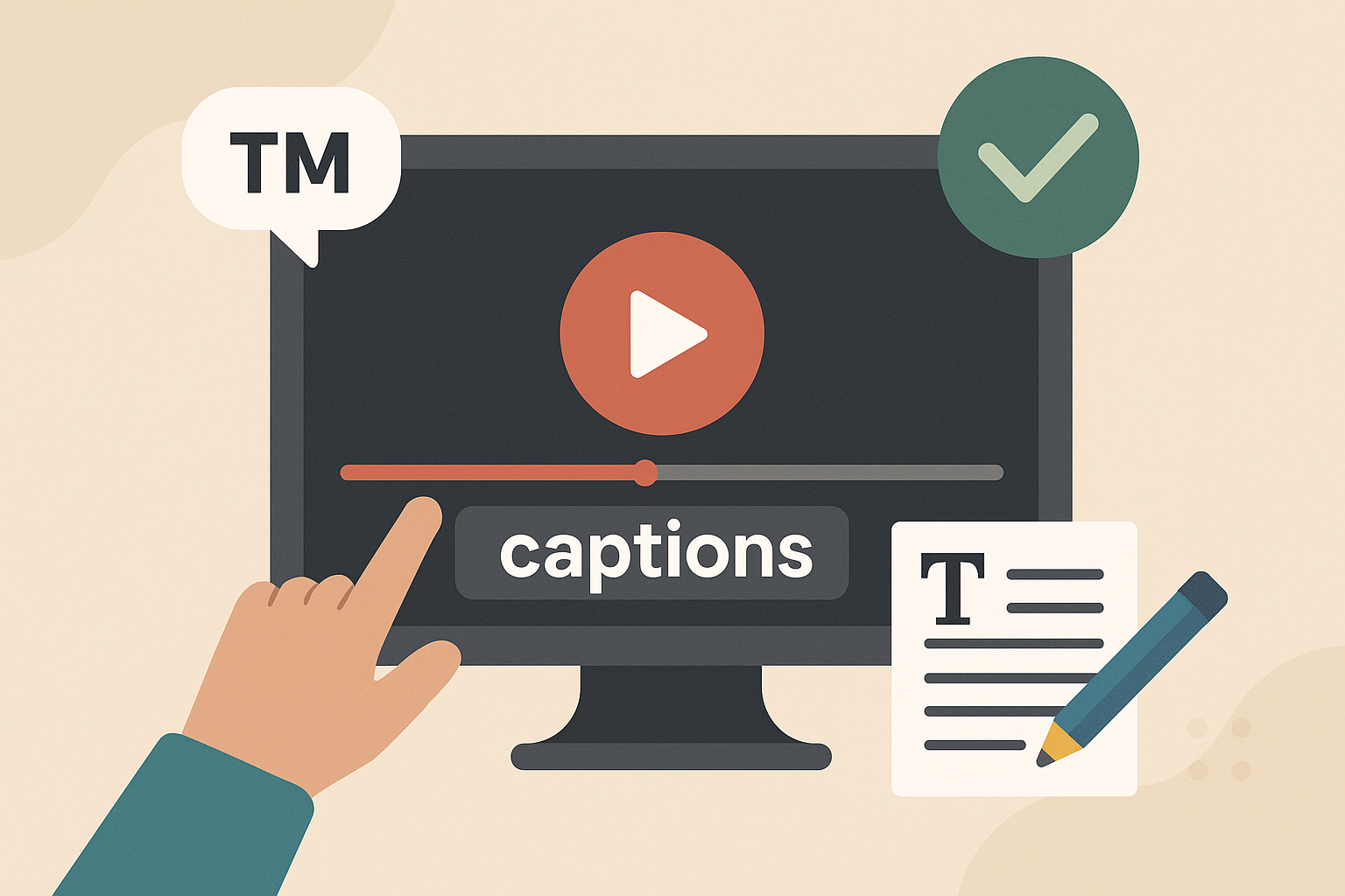
Branded video captions are more than just text overlays – they combine accessibility with your brand’s unique visual elements, like fonts, colors, and styles. They make your video content easier to follow while reinforcing your brand identity. Here’s what you need to know:
- What They Are: Unlike standard captions, branded captions reflect your brand’s look and feel, including typography, color schemes, and design choices.
- Why They Matter: They boost accessibility, improve audience retention, and create a polished, recognizable appearance across all your videos.
- Key Features:
- Use readable fonts (e.g., Arial, Helvetica) and high-contrast colors.
- Incorporate brand colors and fonts without sacrificing clarity.
- Maintain consistent styles across all videos for a unified brand presence.
- Ensure accurate timing and include all audio elements, such as sound effects and speaker identification.
Tools and Tips:
- Platforms like Zight allow you to customize captions with your brand’s fonts, colors, and layouts.
- Test captions on different devices to ensure readability everywhere.
- Use AI tools for efficiency but always review for accuracy.
Branded captions are not just about aesthetics – they ensure your content is accessible and professional while strengthening your brand identity.
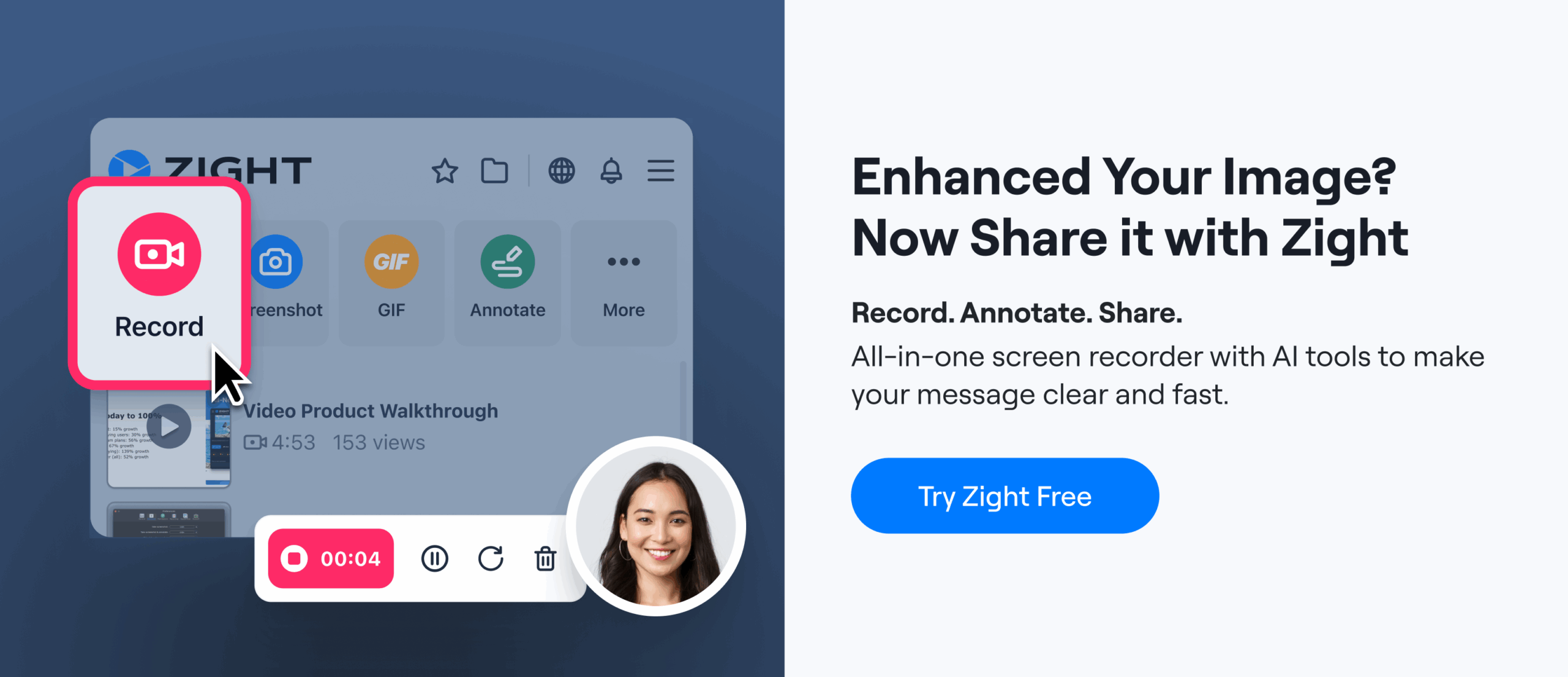
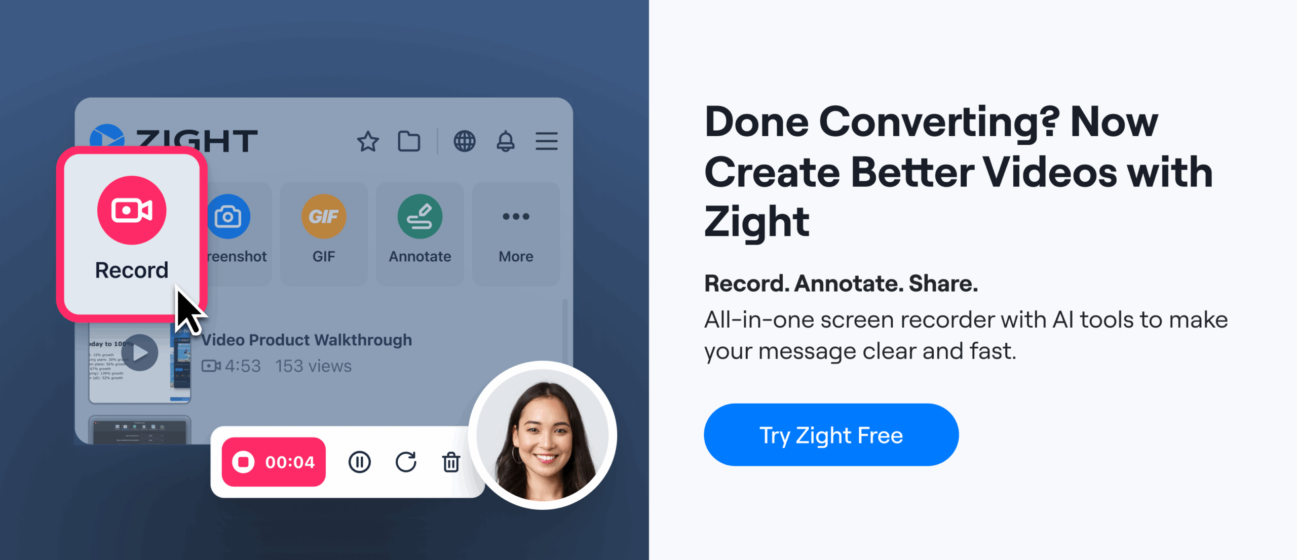
How to Add Branded Captions to Your Videos in Under 30 Seconds
Core Principles for Effective Branded Captions
Crafting branded captions that work well means striking a balance between your brand’s visual identity and accessibility standards. It’s not just about looking good – it’s about ensuring your captions are easy to read while staying true to your brand. Let’s dive into how to make captions both clear and visually aligned with your brand.
Focus on Readability
Readability should always come first. When adding brand elements to your captions, clarity takes precedence. As 3Play Media puts it:
“When creating a captioning or subtitling style guide for your brand, remember that accessibility must be placed before aesthetics.”
If your brand guidelines clash with best practices for captions, readability wins. For instance, sans-serif fonts with medium thickness are ideal for captions because they remain sharp and clear, even at smaller sizes. Fonts like Arial, Helvetica, and Roboto are great choices, and sizes between 22pt and 28pt work well for HD and 4K videos, especially on mobile devices.
Contrast is key. High contrast between text and background ensures captions are visible. Light-colored text, such as white or yellow, stands out against dark backgrounds. Semi-transparent backgrounds can also boost visibility without completely covering the video content. Using a color contrast checker ensures your captions meet accessibility standards.
Testing your captions across different platforms and screen sizes is equally important. This ensures they remain legible no matter where or how they’re viewed. Once readability is locked in, you can focus on weaving in your brand’s colors and fonts.
Using Brand Colors and Fonts Properly
Your brand colors and fonts can add personality to captions – but only if they don’t sacrifice clarity. If your brand font is too thin or ornate to read easily at smaller sizes, reserve it for titles or key phrases. For dialogue and longer text, stick to a simpler, more legible font.
If your brand colors don’t provide enough contrast, use them as accents instead of primary text colors. For instance, white text paired with a brand-colored background or outline can strike a good balance.
Standard caption formatting offers helpful inspiration. Closed captions often use white text on an opaque or semi-transparent black box, while subtitles typically feature white text with a black outline or shadow. You can adapt these styles by incorporating your brand’s colors into background elements or borders, ensuring the text remains easy to read.
Keep Consistency Across Videos
Consistency is the glue that holds your visual identity together. Uniform caption styles across all videos create instant recognition for your brand and ensure a polished viewing experience. This consistency should apply not just to fonts and colors but also to text placement, timing, background styling, and animations.
Develop a style guide that outlines font sizes, color palettes, positioning, and timing for all your content. For example, while training videos might have different caption placement than product demos, both should stick to the same typography and color scheme to maintain brand cohesion.
Consistency within individual videos is just as important. Switching fonts or styles mid-video can confuse viewers and distract from your message. Instead, emphasize key words or phrases by using bold text or subtle color changes – without introducing entirely new fonts.
To save time and maintain quality, consider creating caption templates tailored to different types of videos, such as marketing content, training sessions, or product tutorials. These templates should follow your brand’s visual guidelines while keeping accessibility front and center across all platforms and formats.
Styling and Formatting Guidelines for Branded Captions
When it comes to branded captions, the details matter. The way you style and format text – everything from font choice to placement – can directly influence how your audience perceives your content. Captions that are visually clear and aligned with your brand identity not only boost readability but also reinforce recognition. The challenge is ensuring these decisions work seamlessly across various platforms and devices.
How to Select Fonts for Video Captions
Choosing the right font for your captions isn’t just about aesthetics – it’s about functionality. Fonts need to render correctly across all platforms to avoid any technical hiccups that could distort your captions.
For maximum readability, stick to sans-serif fonts with clean, simple shapes. These fonts maintain clarity even at smaller sizes, which is especially important for mobile viewers. While your font should align with your brand’s overall style, don’t let design trends compromise legibility. For example, a decorative script font might look great in print but can become unreadable when scaled down for captions.
If your content reaches a global audience, language support is a must. Make sure your chosen font can handle multiple languages and special characters to keep your captions consistent across markets.
Some brands set the standard for caption font choices. Netflix, for instance, uses a minimalist font paired with white text on black backgrounds. This approach ensures readability while reflecting their sleek, user-friendly design. Similarly, The New York Times opts for standard fonts with high contrast, ensuring captions provide information without overshadowing visuals.
Before finalizing your font, check the guidelines of the platforms you’re using. Many streaming services and social media platforms have specific recommendations or restrictions that could impact how your captions appear.
Font Size and Spacing Best Practices
Font size should strike a balance between readability and visual harmony. Captions need to be large enough to read easily but not so big that they dominate the screen or distract from the content.
Line spacing is equally important. Proper spacing ensures captions don’t feel cramped while also preventing them from taking up too much screen space. Well-spaced lines help viewers process the text quickly and comfortably.
Always test your captions on different devices to confirm they remain clear and legible, whether viewed on a smartphone, tablet, or TV screen.
Where to Position Captions
Caption placement is just as critical as font and spacing choices. Positioning captions strategically ensures they don’t interfere with key visual elements while maintaining a cohesive look. The bottom-center of the screen is a reliable default, but adjustments may be needed depending on your video’s layout.
Avoid placing captions over areas of the screen that viewers need to focus on, such as speaker faces, product demonstrations, or essential graphics. If your video includes lower-third elements like logos or titles, consider moving captions higher to prevent overlap. Thoughtful placement respects both your content and your audience.
BuzzFeed Tasty offers a great example of effective caption placement. Their vibrant food videos use bold fonts and bright colors, but captions are always carefully positioned to avoid covering important visuals.
Consistency is key. Within a single video, avoid shifting caption positions unless absolutely necessary. Sudden changes can distract viewers and disrupt the flow. If adjustments are unavoidable – such as for varying on-screen content – ensure transitions are smooth and logical.
To maintain uniformity across your video library, consider creating specific guidelines for different types of content. For example, training videos might benefit from one placement style, while marketing content might require another. Documenting these preferences in a style guide will help keep your captions consistent.
Finally, always prioritize accessibility. Some viewers depend on captions to understand your content, so clarity and readability should take precedence. If a styling choice conflicts with accessibility needs, accessibility should always come first.
sbb-itb-5d91f01
Caption Accuracy and Accessibility
Captions play a dual role: they make content accessible and enhance communication. To meet these goals, captions need to be timed accurately and include all relevant details. Mistimed or incomplete captions can create obstacles, especially for viewers who rely on them.
Review for Accuracy and Timing
Timing is everything when it comes to captions. If they show up too early or too late, it can throw off the entire viewing experience. This is especially challenging for people with hearing impairments or those navigating language barriers. As one expert put it:
“Accurate caption timing is the foundation of clear communication in videos. Captions that appear too early or too late disrupt the viewing experience, especially for those who rely on them due to hearing impairments or language barriers.”
To ensure proper timing, assign specific start and end timecodes to each caption. The caption should begin with the first audio frame and stay visible for at least 0.5 seconds after the dialogue ends or when a new shot begins. Avoid overlapping captions – each one should have its own distinct timeframe.
Tools like Aegisub, Adobe Premiere Pro, or AI-driven captioning software can simplify this process, helping you nail down timing with precision.
Once timing is sorted, the next step is to ensure all audio elements are represented.
Include Non-Dialogue Elements
Accessibility goes beyond just transcribing spoken words. Captions should capture the full audio experience, including non-dialogue sounds like [phone ringing] or [door slams]. These details help paint a complete picture for viewers.
Use brackets to label sounds (e.g., [laughter], [thunder], [upbeat music]) and parentheses to identify speakers (e.g., (John) or (Narrator)). Even moments of silence can be meaningful – if a pause adds emotional weight, note it in the captions. When music sets the tone or aligns with your brand, describe it specifically, like [gentle acoustic guitar] or [dramatic orchestral theme].
Including these elements shows a commitment to creating an inclusive and detailed experience for all viewers.
Keep Captions Concise and Clear
Clarity is key. Each caption should express a single, complete thought, using simple and concise language. Break longer sentences into smaller chunks to make them easier to follow alongside the visuals. Eliminate filler words so that every part of the caption serves a purpose.
Tools and Technology for Branded Captions
When it comes to branded captions, having the right tools and technology can make all the difference. They help you seamlessly integrate your brand’s aesthetic into every caption, while also ensuring accessibility and consistency. With the right approach, captions can become a powerful extension of your brand identity.
Choose the Right Platform for Branded Captions
To ensure your captions align with your brand, look for platforms that allow you to customize fonts, colors, logos, and positioning. Features like speaker identification and animation controls are also essential for maintaining a cohesive look across your video content.
One standout option is Zight, a platform designed for branded caption creation. It uses AI-powered transcription to generate accurate captions automatically, while offering robust customization tools. You can adjust fonts, color schemes, and positioning to adhere to your brand guidelines. Plus, its video editing tools give you precise control over caption timing and appearance, making it easy to deliver a polished and professional experience.
By consistently branding your captions, you not only enhance recognition but also create a viewing experience that feels aligned with your overall identity.
Use AI-Powered Features for Efficiency
AI has transformed the way captions are created, offering unmatched speed and accuracy compared to manual transcription. Zight’s AI-powered transcription is particularly effective, converting speech to text quickly and accurately. It even offers translation capabilities, which is invaluable for maintaining a unified brand presence across different languages.
While AI tools can handle tasks like speaker identification, dialogue timing, and formatting suggestions, they’re not flawless. Always review outputs to ensure they capture your brand’s tone and terminology. AI might not fully grasp the nuances of your brand voice or emotional tone, so a final human touch is essential.
Test Captions Across Devices
Your captions need to look great on every device, from smartphones to desktop screens. Variations in how fonts, colors, and positions render across devices can impact both accessibility and brand presentation.
Develop a testing routine to check captions on different screen sizes, operating systems, and backgrounds. This ensures they remain clear and legible in all contexts. Zight simplifies this process with its multi-platform support, ensuring captions maintain their appearance across Mac, Windows, Chrome, and iOS devices.
To further streamline the process, document your testing results and create clear guidelines for applying specific caption styles. This way, your team can adapt formatting quickly without sacrificing consistency or accessibility. With these steps, your branded captions will stay reliable and visually appealing across all platforms.
Conclusion
Branded video captions do much more than serve a technical purpose – they make your content accessible, strengthen your brand identity, and encourage higher engagement. When done right, captions turn your videos into a more inclusive experience, reaching broader audiences while maintaining a cohesive and professional visual presence.
To get it right, focus on clarity and readability. Use high-contrast colors and fonts that are easy to read. This isn’t just about design; it’s about showing your audience that your brand values inclusivity.
Consistency is another key ingredient. Uniform captions across all your videos help build trust and recognition, giving your brand a polished and dependable image. This kind of visual consistency not only reinforces your messaging but also makes your content stick in the minds of viewers.
Tools like Zight make captioning easier by allowing you to customize captions to match your brand guidelines while ensuring accuracy across devices. These AI-powered solutions simplify the process without sacrificing quality.
But captions aren’t just about style – they’re also about performance. Regularly analyzing engagement metrics like watch time and completion rates helps you understand what works best for your audience. A/B testing different caption styles can provide actionable insights, allowing you to fine-tune your strategy and make your captions even more impactful.
Today, captions are a vital part of creative communication, not just a compliance box to check. As video continues to dominate digital marketing, brands that excel in creating accessible, consistent, and engaging captions will stand out. By blending thoughtful design, smart technology, and data-driven improvements, your captions can do more than enhance your content – they can build loyalty, one frame at a time.
FAQs
What are the best practices for creating branded video captions that are both visually appealing and accessible?
To craft branded video captions that are visually striking and accessible, start with clear, high-contrast fonts – think white text on a black background. This combination ensures your captions are easy to read for all viewers. Also, make sure the font size is large enough to be legible without pulling attention away from the video itself.
Timing is everything – your captions should be perfectly synced with the audio, appearing exactly when the words are spoken. Keep the design consistent throughout the video, and avoid overloading it with flashy animations or cluttered elements. Simplicity helps viewers stay focused and improves accessibility.
Above all, aim for accuracy and thoroughness. Captions should include every word spoken, along with relevant sound effects or audio cues. This makes your content inclusive for everyone, especially those with hearing impairments.
What are the best practices for keeping video caption styles consistent across different content types?
To keep your video captions looking consistent and professional, start by developing a style guide. This should include details like the font type, size, color, and placement of your captions. A clear guide ensures your captions match your brand’s look and feel.
Choose a font and color scheme that represents your brand while being easy to read. High-contrast colors work well to improve readability and make your content more accessible to all viewers.
Lastly, make it a habit to review and refresh your templates regularly. Whether it’s for tutorials, marketing videos, or social media clips, maintaining consistency across formats strengthens your brand identity and keeps your videos polished.
How can I test my video captions to ensure they are readable and reflect my brand across different devices and platforms?
To make sure your video captions are easy to read and reflect your brand identity, test them on different devices and screen sizes. This ensures the text stays clear and legible no matter where it’s viewed. Stick to consistent fonts, colors, and styles to create a unified and recognizable brand appearance.
You can also simplify the process by creating templates for your captions. Templates help keep formatting consistent across all your videos. Don’t forget to double-check timing and accuracy – mistimed or incorrect captions can be distracting and pull attention away from your content. Regular testing not only improves readability but also showcases your brand’s professionalism and keeps your audience focused and engaged.